
Data-Driven UX: The System That Turns Visitors Into Customers
Table of Contents+
- Why Does UX Need a System, Not Just Designers?
- UX Research Methodology: Where Every Good Decision Starts
- How Do You Build a Conversion Rate Optimization Framework?
- A/B Testing Frameworks: How to Run Experiments That Actually Work?
- Design Systems: The Infrastructure That Scales Conversion Gains
- Does Accessibility Actually Impact Conversion Rates?
- Why Is Mobile UX the Biggest Conversion Opportunity?
- How Should You Design Dashboards That Drive Action?
- Activation Rate Optimization: The SaaS Growth Lever Most Teams Ignore?
- What UX KPIs Should You Tie to Revenue?
- How Do You Build a UX Performance Culture?
- The Complete Data-Driven UX Playbook
- References
TL;DR
Data-driven UX is a system that uses user research, behavioral analytics, and controlled experimentation to make every design decision measurable. It replaces gut instinct with evidence. Companies that adopt this approach see 2-3x higher conversion rates, faster activation, and revenue growth that compounds with every sprint cycle.
Key Takeaways
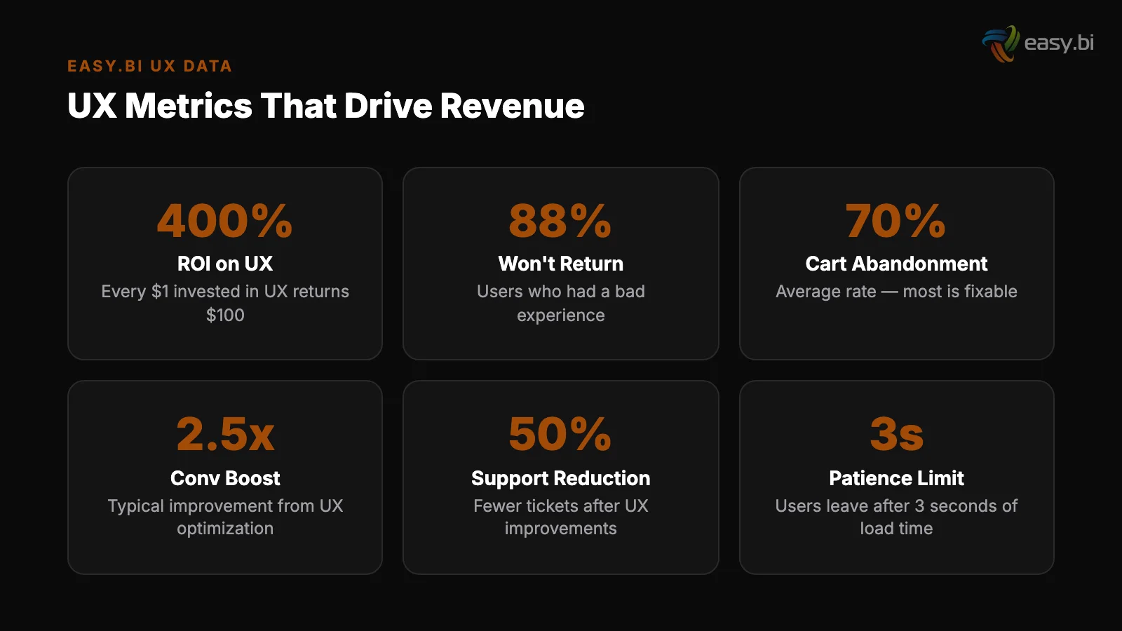
- •Every $1 invested in UX returns $100 — yet most companies still treat UX as a cosmetic exercise, not a revenue system.
- •Data-driven UX replaces opinion-based design with a cycle of research, hypothesis, experiment, and measurement tied directly to business KPIs.
- •Design systems reduce design and development time by 25-50% while enforcing consistency that lifts conversion rates across every touchpoint.
- •Only 1 in 8 A/B tests produces statistically significant results — disciplined experimentation frameworks separate teams that improve from teams that guess.
- •Mobile conversion rates lag desktop by 63%, making mobile UX optimization the single largest untapped revenue opportunity for most digital products.
Data-driven UX combines user research, A/B testing, and design systems to lift conversion rates by 2-3x. Learn the full system: methodology, KPIs, and real case results.
Data-driven UX is a system that uses user research, behavioral analytics, and controlled experimentation to make every design decision measurable. It replaces gut instinct with evidence. Companies that adopt this approach see 2-3x higher conversion rates, faster activation, and revenue growth that compounds with every sprint cycle.
That definition matters because most organizations still treat UX as a subjective discipline — something that happens in Figma and ends when the mockup gets approved. The result: 70% of online businesses that fail cite poor usability as a primary factor [1]. Not bad marketing. Not weak products.
Bad user experience, designed without data, deployed without measurement.
This article lays out the complete system. From research methodology to A/B testing frameworks, from design systems to accessibility, from mobile UX to dashboard design — every component connected to the metrics that matter: conversion rate, activation rate, and revenue per visitor.
Why Does UX Need a System, Not Just Designers?
UX without a system produces inconsistent results. You hire talented designers, they create beautiful interfaces, and conversion rates stay flat. The problem is not talent — it is the absence of a repeatable process that connects design decisions to business outcomes.
Forrester Research found that every $1 invested in UX returns $100, an ROI of 9,900% [2]. McKinsey's Design Index showed that companies in the top quartile of design performance outperformed industry-benchmark growth by as much as two to one [3]. These numbers don't come from hiring better designers.
They come from building a system where design decisions are informed by data, validated through experimentation, and measured against revenue KPIs.
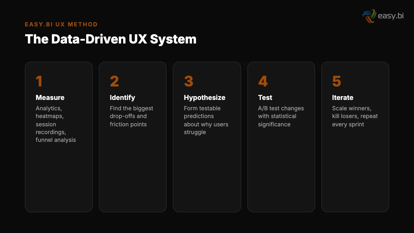
A data-driven UX system has four components:
- Research: Qualitative and quantitative methods to understand user behavior.
- Hypothesis: Specific, testable predictions about what will improve a metric.
- Experimentation: Controlled tests (A/B, multivariate) that isolate the impact of each change.
- Measurement: KPIs tied directly to revenue, not vanity metrics like page views or time on site.
Without all four components working together, UX becomes opinion-driven. The highest-paid person in the room picks the layout. The designer with the strongest portfolio picks the color scheme. And nobody knows whether the result actually converts better than what came before.
See how we deliver AI-powered efficiency gains.
UX Research Methodology: Where Every Good Decision Starts
Good UX research answers two questions: what are users doing, and why are they doing it. Before running research, a structured UX audit helps you identify the most critical problems — see our UX Audit Checklist: 30 Things to Fix Before You Redesign. Quantitative data answers the first question.
Qualitative research answers the second. You need both.
The most effective research methodology combines 5 methods in a specific sequence:
| Method | Type | What It Reveals | When to Use |
|---|---|---|---|
| Analytics audit | Quantitative | Where users drop off, which paths convert | Before any design work |
| Heatmaps and session recordings | Quantitative | Where users click, scroll, and hesitate | After identifying problem pages |
| User interviews (5-8 participants) | Qualitative | Why users behave a certain way | After identifying patterns in data |
| Usability testing (5 participants) | Qualitative | Where the interface breaks user expectations | Before and after design changes |
| Survey / on-site polls | Quantitative | Satisfaction, intent, blockers at scale | Ongoing — monthly or quarterly |
Nielsen Norman Group established that 5 user tests uncover approximately 85% of usability problems [4]. That means you don't need a 50-person research panel to find the issues killing your conversion rate. You need 5 well-recruited participants and a structured test protocol.
64% of CRO professionals use heatmaps as their primary qualitative research tool [5]. Heatmaps show you what users actually do, not what they say they do.
When a heatmap shows that 70% of users never scroll past your hero section, you know the above-fold experience is either capturing or killing engagement.
The research phase should take 2-3 weeks for an existing product. For a new product, plan for 4-6 weeks. The output is not a 60-page report that nobody reads. It is a prioritized list of hypotheses, each tied to a specific metric and a specific page or flow.
How Do You Build a Conversion Rate Optimization Framework?
Conversion rate optimization is not random testing. If you want quick wins before running a full CRO program, see Conversion Rate Optimization Without Redesigning Anything. It is a structured framework that prioritizes the highest-impact experiments and runs them with statistical rigor.
Without a framework, teams waste months testing button colors while ignoring checkout flows that lose 70% of revenue.
The average website conversion rate across industries is 2.35%, with the top 25% converting at 5.31% or higher [6]. The gap between average and top-quartile is not luck. It is the result of systematic, data-driven optimization applied consistently over time.
A CRO framework has 5 stages:
- Audit: Identify the biggest leaks in your funnel. Where is revenue leaving? Cart abandonment sits at 69.99% across 49 studies [7]. Your checkout flow is almost certainly underperforming.
- Prioritize: Use an ICE scoring model (Impact, Confidence, Ease) to rank opportunities. A checkout optimization that could lift revenue by 15% ranks higher than a homepage headline test.
- Hypothesize: Write testable hypotheses: "Reducing checkout form fields from 11 to 4 will increase completion rate by at least 30%, based on HubSpot's research showing up to 120% improvement" [8].
- Test: Run A/B tests with proper statistical power. A/B tests need a minimum of 1,000 conversions per variation to reach reliable 95% statistical significance [9].
- Scale: Roll out winners. Document learnings. Feed insights back into the next research cycle.
The most common mistake is running too many tests simultaneously with too little traffic. Only 1 in 8 A/B tests produces statistically significant results that drive change.
That means you need a high-velocity testing program — companies running 12+ experiments per year see 2-3x better conversion improvements than those running fewer.
"Conversion rate optimization is not about finding tricks. It is about removing friction, clarifying value, and making the next step obvious. Every test that fails teaches you something about your users. Every test that wins compounds."
A/B Testing Frameworks: How to Run Experiments That Actually Work?
Most A/B tests fail because teams skip the math. For a deep dive into the statistics and common mistakes, see A/B Testing That Actually Works (Most of Yours Don't). They launch a test on Monday, check results on Friday, declare a winner, and move on.
This produces false positives that waste development resources and erode trust in experimentation.
A rigorous A/B testing framework requires 4 elements:
1. Sample size calculation before launch
1. Sample size calculation before launch. Determine how many visitors you need based on your baseline conversion rate, the minimum detectable effect you care about, and your desired statistical power (typically 80%).
For a page converting at 3% where you want to detect a 10% relative improvement, you need approximately 87,000 visitors per variation.
2. Test duration planning. Run tests for full business cycles — minimum 2 weeks, ideally 4. Weekend traffic behaves differently from weekday traffic. Holiday periods skew results. Cutting a test short because the early data looks promising is the most common statistical error in CRO.
2. Test duration planning
3. Single-variable isolation. Test one thing at a time. If you change the headline, the CTA button, and the hero image simultaneously, you cannot attribute the result to any single change. Multivariate testing handles multiple variables, but requires significantly more traffic.
4. Pre-registered hypotheses. Write your hypothesis and success criteria before launching the test. This prevents post-hoc rationalization — the tendency to look at results and retroactively explain why they make sense, even when the data is noise.
58% of companies conduct A/B testing for CRO, making it the most popular optimization method [10]. But popularity doesn't equal proficiency. The difference between teams that improve and teams that spin their wheels is discipline: proper sample sizes, full-cycle durations, and honest interpretation of results.
Design Systems: The Infrastructure That Scales Conversion Gains
A design system is not a style guide. It is a living, versioned library of components, patterns, and guidelines that ensures every interface element performs consistently across every page, every product, and every team.
Design systems reduce design and development time by 25-50% [11]. Companies with mature design systems report 47% faster time-to-market for new features [12]. These efficiency gains are significant, but the real value is consistency. Every button, form field, and navigation pattern behaves the same way across your entire product.
Users learn the interface once and trust it everywhere.
For the full Siemens case study on enterprise design systems, see Design Systems for Enterprise: Siemens Case Study. When easy.bi built a unified UI library for Siemens, the goal was exactly this: create a single source of truth for design components that multiple teams across the organization could use.
The system was built with Angular, Storybook, and Figma — ensuring that designers and developers worked from the same component library. The result was a consistent user experience across previously fragmented product interfaces, with measurable reduction in development time for new features.
A conversion-focused design system includes:
- Component library: Buttons, forms, cards, modals — all coded, tested, and documented.
- Pattern library: Checkout flows, onboarding sequences, search interfaces — proven interaction patterns that teams reuse rather than reinvent.
- Design tokens: Colors, spacing, typography, and animation values defined as variables, not hardcoded values. This enables theme-wide A/B tests (testing an entire visual treatment, not just a button color).
- Usage guidelines: Not just how components look, but when and why to use each one. A "destructive action" button has different styling than a "primary action" button for a reason — and that reason should be documented.
Without a design system, every new feature is designed from scratch. Inconsistencies creep in. The checkout button on the product page behaves differently from the checkout button in the cart. Users notice. Trust erodes. Conversion drops.
Does Accessibility Actually Impact Conversion Rates?
Yes. Improving accessibility can increase an e-commerce site's customer base by up to 20%, because 15% of the global population has some form of disability. For a business-focused breakdown of accessibility ROI and quick wins, see Accessibility as a Business Advantage, Not a Compliance Checkbox. [13].
Accessibility is not a compliance checkbox. It is a market expansion strategy that also happens to be the right thing to do.
The current state of web accessibility is poor. 96.3% of home pages have detectable WCAG 2 accessibility failures, with an average of 56.8 errors per page [14].
That means nearly every website excludes a significant portion of potential customers through preventable design failures: missing alt text, insufficient color contrast, keyboard traps, and unlabeled form fields.
The business case extends beyond the disability community. Accessibility improvements benefit every user:
- Keyboard navigation helps power users who prefer keyboard shortcuts over mouse clicks.
- High-contrast text improves readability for users on low-quality monitors, in bright sunlight, or over age 40.
- Proper heading hierarchy helps screen readers and improves SEO — search engines use heading structure to understand page content.
- Descriptive link text ("Read the full case study" instead of "Click here") improves clarity for all users and helps search engines understand link context.
In the European Union, the European Accessibility Act (EAA) takes effect in June 2025, requiring all e-commerce websites and digital services to meet accessibility standards. Companies that treat this as a last-minute compliance project will spend 3-5x more than those who build accessibility into their design system from day one.
"Accessibility is not a feature you add later. It is a quality of your design system that either exists from the beginning or costs 10x more to retrofit."
Why Is Mobile UX the Biggest Conversion Opportunity?
Mobile conversion rates average 1.53% compared to 4.14% on desktop. For a practical guide tailored to B2B mobile patterns, see Mobile UX for B2B: Your Enterprise Users Are on Phones Now. [15]. That 63% gap represents the single largest untapped revenue opportunity for most digital products.
Mobile traffic already accounts for 60% of e-commerce visits, yet the mobile experience consistently underperforms.
The reasons are structural, not cosmetic:
Touch targets
Speed. 53% of mobile users abandon sites that take longer than 3 seconds to load [16]. A 1-second delay in page load time leads to a 7% reduction in conversions [17].
Mobile networks are slower, devices have less processing power, and most mobile pages are still built as responsive adaptations of desktop designs rather than mobile-first experiences.
Touch targets. Buttons designed for mouse cursors are too small for thumbs. Form fields that work on a 27-inch monitor become painful on a 6-inch screen. Mobile UX requires fundamentally different interaction design — larger targets, fewer fields, and gesture-based navigation.
Context
Context. Mobile users have different intent. They're often in research mode, comparison-shopping, or completing a task they started on desktop. A mobile experience optimized for the same conversion funnel as desktop misses the point. Mobile needs its own funnel, optimized for mobile-specific behaviors.

Sites that meet Core Web Vitals thresholds see 24% fewer page abandonments [18]. The three Core Web Vitals metrics — Largest Contentful Paint (LCP), Interaction to Next Paint (INP), and Cumulative Layout Shift (CLS) — provide a concrete measurement framework for mobile performance.
Responsive design alone increases mobile conversion rates by 11% compared to separate mobile sites [19], but true mobile-first design goes further: it starts with the smallest screen and expands upward.
3x faster development with our ebiCore AI framework
Identify your top AI opportunities, validate with a PoC, and ship to production.
Start with a Strategy CallHow Should You Design Dashboards That Drive Action?
Dashboards are where data-driven UX meets decision-making. For a sprint-scoped playbook on fixing dashboard UX, see Why Your Dashboard Confuses Users (And How to Fix It in a Sprint). A well-designed dashboard doesn't just display data — it surfaces the insight that triggers the next action.
Most dashboards fail this test. They show too many metrics, lack hierarchy, and force users to do mental math that the interface should handle.
The principles of dashboard design mirror the principles of conversion optimization:
| Principle | Dashboard Application | Conversion Parallel |
|---|---|---|
| Progressive disclosure | Show summary first, details on click | Show value proposition first, details on scroll |
| Visual hierarchy | KPIs at top, supporting data below | CTA above fold, social proof below |
| Reduce cognitive load | Maximum 5-7 metrics per view | Maximum 3-4 form fields per step |
| Contextual information | Show trends and comparisons, not raw numbers | Show pricing relative to value, not absolute cost |
| Clear next actions | Every metric links to the action it suggests | Every section ends with a clear CTA |
Users spend 57% of their page-viewing time above the fold [20]. In dashboard design, this means your most critical KPIs must be visible without scrolling. If a manager needs to scroll past 3 charts to find the metric that tells them whether to take action, the dashboard has failed.
Dashboard design also benefits from the same iterative testing that drives CRO. Track which dashboard views get the most usage. Measure time-to-insight: how long does it take a user to find the information they need? A/B test different layouts to find the arrangement that minimizes clicks to action.
Activation Rate Optimization: The SaaS Growth Lever Most Teams Ignore?
Activation rate measures the percentage of new users who complete a key action that predicts long-term retention. For a deep dive into diagnosing and fixing activation rate problems, see The Activation Rate Problem: Why Your Users Sign Up and Disappear.
For a project management tool, that might be "created first project." For an e-commerce platform, it might be "completed first purchase." For a SaaS product, it is the moment the user first experiences the product's core value.
Activation rate is the most underleveraged metric in digital products. Most teams obsess over acquisition (getting users in the door) and retention (keeping them), while ignoring the step between: activation (getting them to the value).
easy.bi has seen SaaS clients double their activation rates by applying data-driven UX principles to the onboarding flow. The approach follows a consistent pattern:
- Map the activation moment. Identify the specific action that correlates with long-term retention. Use cohort analysis to find it — compare the behavior of users who stayed for 90 days with those who churned in the first week.
- Measure time-to-activation. How long does it take the average new user to reach the activation moment? Every hour of friction between signup and activation is a revenue leak.
- Remove friction before the activation point. Every field, screen, and decision between signup and the activation moment is a potential drop-off. Reduce form fields. Defer account setup. Pre-populate defaults. Use progressive disclosure [21].
- Add guidance toward the activation point. Checklists, tooltips, and contextual onboarding messages that nudge users toward the key action. Personalized CTAs convert 202% better than default versions [22].
- Measure and iterate in 2-week cycles. Track activation rate by cohort, by channel, and by user segment. Run A/B tests on onboarding flows with the same rigor you apply to landing pages.
The doubling of activation rates for SaaS clients followed this exact playbook. The first step — identifying the correct activation moment — turned out to be the breakthrough. Most teams assume they know what activation looks like. Data usually tells a different story.
What UX KPIs Should You Tie to Revenue?
Vanity metrics are the enemy of data-driven UX. Page views, session duration, and bounce rate tell you something happened, but not whether it mattered. Revenue-tied KPIs connect design decisions directly to the business outcomes that fund the next design iteration.
The 7 UX KPIs every team should track:
- Conversion rate by step. Not just the overall conversion rate — the conversion rate at each step of your funnel. This reveals exactly where users abandon and exactly where optimization effort should focus.
- Revenue per visitor (RPV). Total revenue divided by total unique visitors. This single metric captures the combined effect of conversion rate and average order value. A UX change that lifts conversion rate but drops order value might be net negative.
- Task completion rate. The percentage of users who successfully complete a defined task (checkout, signup, support ticket). Below 78% indicates significant usability issues.
- Time to value (TTV). How long it takes a new user to experience the core product benefit. Shorter TTV correlates directly with higher activation and retention.
- System Usability Scale (SUS) score. A standardized 10-question survey that produces a score from 0-100. Scores above 68 are considered above average. Track this quarterly to measure perceived usability over time.
- Error rate. The percentage of user interactions that result in errors (failed form submissions, 404 pages, checkout failures). Every error is a conversion leak.
- Customer Effort Score (CES). How easy was it to complete this task? Low-effort experiences correlate with higher retention and willingness to pay.
The critical shift is connecting these KPIs to revenue. When you can say "improving task completion rate from 72% to 85% increased monthly revenue by EUR 45,000," you turn UX from a cost center into a revenue driver. That changes budget conversations, hiring priorities, and the organization's relationship with design.
How Do You Build a UX Performance Culture?
Tools and frameworks mean nothing without the right culture. A UX performance culture is one where every team member — from the CEO to the junior developer — understands that user experience is a measurable business function, not a subjective art form.
Building this culture requires 3 structural changes:
1. Shared visibility into UX metrics
1. Shared visibility into UX metrics. Put conversion rates, activation rates, and task completion rates on dashboards that the entire team sees daily. When the engineering team watches conversion rate drop after a deployment, they fix it in hours instead of days.
When the marketing team sees which landing pages convert and which don't, they stop guessing and start testing.
B2B websites with clear value propositions above the fold convert up to 80% better than those without. This kind of finding should be common knowledge across the entire product team, not siloed in the UX department.
2. Regular cross-functional experimentation reviews
2. Regular cross-functional experimentation reviews. Every 2 weeks, bring together product, design, engineering, and marketing to review test results. What did you learn? What will you test next? What hypotheses were wrong?
Full-page redesigns succeed only 20% of the time; iterative optimization outperforms radical redesign in 4 out of 5 cases. The team that internalizes this runs 50 small experiments instead of 1 big redesign.
3. Investment in user research infrastructure. Budget for tools (analytics, heatmaps, session recording, A/B testing platform) and allocate time for research in every sprint. Fixing a UX problem in development costs 10x more than fixing it during design, and 100x more after release [23].
The ROI of investing in research up front is mathematical, not theoretical.
At easy.bi, we embed this culture into client engagements through our Performance Scrum methodology. Every 14-day sprint includes a UX metric review alongside the standard sprint demo. The question is never "does this look good?" The question is "did this move the metric?"
The Complete Data-Driven UX Playbook
Everything in this article connects into a single system. Here is the complete playbook, sequenced for implementation:
Weeks 1-3: Research and baseline. Run analytics audit, heatmap analysis, and 5 user tests. Establish baseline KPIs for conversion rate, activation rate, revenue per visitor, and task completion rate.
Weeks 1-3: Research and baseline
Weeks 4-5: Hypothesis prioritization. Convert research findings into testable hypotheses. Score with ICE model. Select the top 3-5 experiments for the first cycle.
Weeks 6-9: First experiment cycle. Run 2-3 A/B tests with proper sample sizes. Document results regardless of outcome. Failed tests are data, not failures.
Weeks 10-12: Design system foundation. Based on winning patterns from experiments, codify components into a design system. Enforce consistency. Establish design tokens.
Weeks 4-5: Hypothesis prioritization
Ongoing: 14-day optimization sprints. Every sprint includes at least 1 experiment, 1 research activity, and 1 design system update. Measure results against revenue KPIs every cycle.
This is not theory. It is the system we use across 100+ projects with a 98% client retention rate. The system works because it replaces opinion with evidence, one sprint at a time.
If you want to stop guessing and start measuring, explore our UX Growth services or book an Expert Call to discuss where data-driven UX can move your metrics.
References
- [1] Nielsen Norman Group, "Usability ROI" — 70% of online businesses that fail cite Source
- [2] Forrester Research, "The Six Steps for Justifying Better UX" — Every $1 invested Source
- [3] McKinsey, "The Business Value of Design" — Companies in the top quartile of desi Source
- [4] Nielsen Norman Group, "Why You Only Need to Test with 5 Users" — 5 user tests un Source
- [5] Hotjar, "Conversion Rate Optimization" — 64% of CRO professionals use heatmaps a Source
- [6] WordStream, "What Is a Good Conversion Rate?" — The average website conversion r Source
- [7] Baymard Institute, "Cart Abandonment Rate" — 69. Source
- [8] HubSpot, "Form Fields and Landing Page Conversions" — Reducing form fields from Source
- [9] VWO, "A/B Testing Sample Size" — A/B tests need a minimum of 1,000 conversions p Source
- [10] Econsultancy / Adobe, "Digital Trends" — 58% of companies conduct A/B testing fo Source
- [11] Sparkbox Design Systems Survey — Design systems reduce design and development ti Source
- [12] Figma, "Design Systems at Scale" — Companies with mature design systems report 4 Source
- [13] W3C Web Accessibility Initiative, "The Business Case for Digital Accessibility" Source
- [14] WebAIM Million — 96.3% of home pages have detectable WCAG 2 accessibility failur Source
- [15] Statista — Mobile conversion rates average 1.53% compared to 4. Source
- [16] Google / Think with Google — 53% of mobile users abandon sites that take longer Source
- [17] Akamai — A 1-second delay in page load time leads to a 7% reduction in conversio Source
- [18] Google / web.dev, "Vitals Business Impact" — Sites that meet Core Web Vitals thr Source
- [19] Google / Think with Google — Responsive design increases mobile conversion rates Source
- [20] Nielsen Norman Group, "Scrolling and Attention" — Users spend 57% of their page- Source
- [21] Nielsen Norman Group, "Progressive Disclosure" — Progressive disclosure in forms Source
- [22] HubSpot, "Personalized Calls to Action" — Personalized CTAs convert 202% better
- [23] Nielsen Norman Group, "Usability 101" — Fixing a UX problem in development costs Source
Explore Other Topics
Ready to unlock AI-driven efficiency?
30-minute call with an engineering lead. No sales pitch - just honest answers about your project.
98% engineer retention · 14-day delivery sprints · No lock-in contracts
Related Reading

E-Commerce Conversion Optimization: The 35% Improvement Framework
A systematic 6-lever framework that delivers +35% conversion rate and +22% AOV for DACH e-commerce. Page speed, checkout, product UX, search, cross-sell, and mobile optimization with measurable benchmarks.
Enno Bassen
Why Your E-Commerce Analytics Are Lying to You (And How to Fix It)
Most DACH e-commerce teams make decisions on incomplete data. Learn why GA4 alone is not enough, how consent rates distort your numbers, and how to build a 4-tool analytics stack that shows what is actually happening in your store.
Timo Koerner
Accessibility as a Business Advantage, Not a Compliance Checkbox
Accessibility is not a legal obligation to minimize - it is a market expansion strategy. Learn how the European Accessibility Act affects your products, why 15% of your potential customers have disabilities, and quick wins you can ship this week to improve both accessibility and SEO.
Timo Koerner