
Mobile UX for B2B: Your Enterprise Users Are on Phones Now
Table of Contents+
- How Much B2B Activity Happens on Mobile?
- Should You Build Responsive or Mobile-First?
- How Do You Optimize Touch Targets for Enterprise Interfaces?
- How Do You Optimize Forms for Mobile B2B?
- Why Does Mobile Performance Matter More for B2B?
- What Are Offline-First Patterns, and When Do You Need Them?
- How Do You Measure Mobile UX Success in B2B?
- Where Mobile UX Fits in the Data-Driven UX Approach
- References
TL;DR
The assumption that B2B is a desktop business died years ago, but most B2B websites and enterprise applications haven't gotten the message. Decision-makers research vendors on their commute. Project managers approve timelines from airport lounges. Field teams enter data on construction sites. The context has changed. The interfaces have not.
Key Takeaways
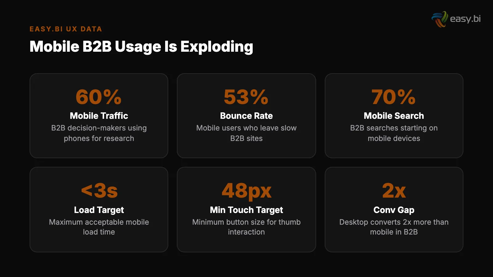
- •Mobile conversion rates average 1.53% compared to 4.14% on desktop — a 63% gap that represents massive untapped revenue for B2B companies.
- •53% of mobile users abandon sites that take longer than 3 seconds to load. B2B sites, with their complex navigation and heavy assets, are especially vulnerable.
- •Responsive design increases mobile conversion rates by 11% compared to separate mobile sites, and mobile-first design forces teams to prioritize content and functionality by importance.
- •Touch targets must be at least 44x44 pixels, and reducing form fields from 11 to 4 can increase mobile conversions by up to 120% — enterprise B2B forms routinely violate both rules.
- •Offline-first patterns, like those used in the WeberHaus order processing system built with Ionic, enable field teams to work without connectivity — a requirement enterprise desktop UX never had to solve.
Mobile conversion rates are 63% lower than desktop. B2B decision-makers now research, compare, and approve purchases on their phones. Learn how to close the mobile gap with responsive design, touch optimization, form reduction, and offline-first patterns.
The assumption that B2B is a desktop business died years ago, but most B2B websites and enterprise applications haven't gotten the message. Decision-makers research vendors on their commute. Project managers approve timelines from airport lounges. Field teams enter data on construction sites. The context has changed. The interfaces have not.
Mobile conversion rates average 1.53% compared to 4.14% on desktop [1]. That 63% gap is not a mobile traffic problem — it is a mobile UX problem.
B2B organizations that treat mobile as an afterthought are losing conversions, productivity, and competitive advantage to organizations that design for mobile as a first-class experience.
This article covers the data behind B2B mobile usage, the difference between responsive and mobile-first approaches for enterprise, the specific UX patterns that close the conversion gap, and how offline-first design extends mobile utility into environments where connectivity is unreliable.
How Much B2B Activity Happens on Mobile?
The shift to mobile in B2B is not hypothetical. Google's research shows that 50% of B2B search queries happen on smartphones, and that number has been growing 3% year-over-year.
B2B buyers are not different from B2C consumers when it comes to device usage — they are the same people, using the same phones, with the same expectations for speed and usability.
The journey is multi-device. A buyer discovers your company on their phone during lunch, reads a case study on their tablet in the evening, and fills out a contact form on their laptop the next morning.
If the mobile experience is frustrating — slow load times, unreadable text, forms that require pinch-zooming — that buyer doesn't return on desktop.
They find a competitor whose mobile experience didn't waste their time. 88% of online consumers are less likely to return to a site after a bad experience [2].
Enterprise applications face an even sharper shift. Field service teams, sales representatives, warehouse managers, and construction supervisors are mobile-primary users. They don't have a desktop alternative. The mobile interface is the only interface. When it fails, the business process fails.
See how we deliver AI-powered efficiency gains.
Should You Build Responsive or Mobile-First?
These terms are often confused. They describe different design strategies with different outcomes.
Responsive design starts with a desktop layout and adapts it to smaller screens. Elements reflow, columns stack, and navigation collapses into a hamburger menu. The content and functionality are the same — only the layout changes. Responsive design increases mobile conversion rates by 11% compared to separate mobile sites [3].
It is the minimum viable approach for any B2B website.
Responsive design
Mobile-first design starts with the smallest screen and expands upward. The mobile layout is designed first, with the most essential content and actions prioritized. Desktop layouts then expand the experience with additional content, larger visuals, and supplementary information.
Mobile-first forces difficult prioritization decisions: what is the one thing this page needs to do on a 375px screen?
For B2B websites (marketing sites, product pages, resource centers), responsive design is sufficient when combined with mobile-specific optimizations: touch target sizing, form reduction, and performance tuning.
For enterprise applications used by mobile-primary workers, mobile-first is the correct approach because the constraints of mobile — limited screen space, touch input, variable connectivity — fundamentally shape the interface design.
| Factor | Responsive (Desktop-First) | Mobile-First |
|---|---|---|
| Starting point | Desktop layout, adapted down | Mobile layout, expanded up |
| Content priority | Everything shown, some hidden on mobile | Essential content first, extras added for desktop |
| Development effort | Lower for existing desktop sites | Higher initial, lower long-term maintenance |
| Performance on mobile | Often compromised — desktop assets loaded | Optimized — only mobile-necessary assets loaded |
| Best for | B2B marketing sites, content-heavy pages | Enterprise apps, field worker tools, mobile-primary users |
| Conversion impact | +11% vs. separate mobile site | Higher — content prioritization improves clarity |
How Do You Optimize Touch Targets for Enterprise Interfaces?
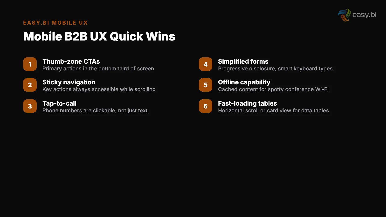
Desktop interfaces rely on a mouse cursor with pixel-level precision. Mobile interfaces rely on a fingertip that covers approximately 45 pixels of screen space. This difference breaks every enterprise interface that was designed for desktop and "made responsive" without addressing interaction design.
Both Apple's Human Interface Guidelines and Google's Material Design specify a minimum touch target of 44x44 pixels (Apple) or 48x48dp (Google). These minimums are based on ergonomic research — they represent the smallest area a human finger can reliably tap without error.
Buttons and CTAs
Enterprise interfaces violate this constantly. Data table rows with 32px height. Action icons that are 24x24 pixels with no padding. Dropdown menus where options are spaced 28px apart. Each undersized target increases misclicks, frustration, and task completion time.
The fixes are specific:
Buttons and CTAs: Minimum 44px height with at least 8px spacing between adjacent buttons. On mobile, stack buttons vertically rather than placing them side by side — this prevents accidental taps on the wrong button.
Navigation links
Navigation links: Each link should have a tappable area of at least 44x44px, even if the visible text is smaller. Use padding to expand the touch target without changing the visual design.
Form inputs: Minimum 48px height. Users should be able to tap into a form field on the first try, every time. Clear inline error messages in forms reduce user drop-off by 22% [4] — but only if users can reach the fields without frustration in the first place.
Data tables: On mobile, data tables should transform into card layouts or collapsible rows. Attempting to display a 10-column table on a 375px screen produces horizontal scrolling, tiny text, and unusable touch targets.
Progressive disclosure — showing summary rows that expand on tap to reveal details — works better than shrinking everything to fit.
How Do You Optimize Forms for Mobile B2B?
B2B forms are where mobile UX fails most visibly. Enterprise lead capture forms routinely request company name, job title, department, company size, phone number, email, country, budget range, timeline, and a message field.
That is 10+ fields — on a screen where each field consumes 60-80px of vertical space and requires keyboard interaction.
Reducing form fields from 11 to 4 can increase conversions by up to 120% [5]. On mobile, the impact is even more dramatic because every field requires a keyboard interaction that obscures half the screen, demands precise input on a small keyboard, and adds 10-15 seconds of friction per field.
The optimization strategy for B2B mobile forms:
Reduce to essentials
Reduce to essentials. For a contact form, name and email are essential. Everything else — company, title, phone, budget — can be collected in the follow-up conversation or enriched through third-party data (Clearbit, ZoomInfo). Every field you remove on mobile is a conversion barrier removed.
Use progressive disclosure. If you need more than 4 fields, break the form into steps. Show fields 1-3, then "Next" to reveal fields 4-6. Progressive disclosure in forms improves completion rates by 20-40% [6]. Multi-step forms outperform single-step forms by up to 300% for complex lead generation scenarios [7].
On mobile, this is not optional — it is required for any form with more than 4 fields.
Optimize input types. Use type="email" to trigger the email keyboard. Use type="tel" for phone numbers. Use inputmode="numeric" for number-only fields. Use autocomplete attributes so browsers can fill fields automatically. These are zero-cost optimizations that reduce input effort by 30-50% on mobile.
Use progressive disclosure
Provide inline validation. Inline form validation increases successful completions by 22% and decreases errors by 22% [8]. On mobile, where re-entering data is particularly painful, inline validation prevents the frustrating experience of submitting a form, scrolling back to find errors, and re-entering corrected data on a small screen.
"Every form field you add on mobile is not just friction — it is a decision point where the user asks 'is this worth the effort?' On a 6-inch screen with a tiny keyboard, the threshold for 'not worth it' is dramatically lower than on desktop.
Four fields is the maximum for mobile lead capture. If you need more, you need multi-step."
Why Does Mobile Performance Matter More for B2B?
53% of mobile users abandon sites that take longer than 3 seconds to load [9]. B2B sites are disproportionately affected because they tend to be heavier than B2C sites: large hero images, embedded videos, complex navigation structures, third-party analytics scripts, and marketing automation tags.
Pages loading within 2 seconds have an average bounce rate of 9%, while pages loading in 5 seconds see 38% [10]. That is a 4x increase in bounce rate from 3 additional seconds of load time.
For a B2B site where each conversion is worth thousands of euros, those 3 seconds represent a directly quantifiable revenue loss.
Lazy load below-the-fold images
The mobile performance checklist for B2B:
Lazy load below-the-fold images. Lazy loading below-the-fold images improves Largest Contentful Paint (LCP) by 25% on average [11]. On B2B sites with case study galleries, team photos, and client logos, this single optimization often shaves 1-2 seconds off initial load time.
Serve images in WebP format
Serve images in WebP format. WebP provides 25-35% smaller file sizes than JPEG at equivalent quality. For a B2B site with 20 images on the homepage, that translates to 200-500KB of bandwidth savings — meaningful on mobile connections.
Defer non-critical JavaScript. Marketing automation scripts (HubSpot, Marketo), chat widgets (Intercom, Drift), and analytics tags (Google Tag Manager, Hotjar) should load after the page is interactive. They are important for the business, but they are not important for the user's first 3 seconds.
Meet Core Web Vitals thresholds. Sites that meet Core Web Vitals thresholds see 24% fewer page abandonments [12]. Websites with Interaction to Next Paint (INP) under 200ms see 22% lower bounce rates [13].
These are not vanity metrics — they directly measure the experience that determines whether a B2B prospect stays or leaves.
3x faster development with our ebiCore AI framework
Identify your top AI opportunities, validate with a PoC, and ship to production.
Start with a Strategy CallWhat Are Offline-First Patterns, and When Do You Need Them?
Offline-first design means the application works without an internet connection and synchronizes data when connectivity returns. This is not a niche concern — it is a requirement for any enterprise application used by field workers, sales teams in remote areas, or operational staff in buildings with poor connectivity.
The WeberHaus order processing system is a concrete example. WeberHaus, a German prefabricated house manufacturer, needed their order processing system to work on construction sites where cellular connectivity is unreliable. easy.bi built the system using Angular and Ionic with full offline capability.
Field teams enter order data, capture photos, and update project status without connectivity. When the device reconnects, data synchronizes automatically with the central system.
Local data storage
This pattern — which easy.bi delivered as part of a full 100% process digitization for WeberHaus — requires specific architectural decisions:
Local data storage. Use IndexedDB or SQLite for structured data and the Cache API for static assets. The application stores a complete working dataset locally, not just a cached version of the last server response.
Conflict resolution
Conflict resolution. When two users modify the same record offline, the system needs a strategy for resolving conflicts on sync. Last-write-wins is the simplest approach. For enterprise data where accuracy matters, field-level merge with user notification is more appropriate.
Sync status indicators. Users must always know whether their data has been synchronized. A persistent indicator showing "Saved locally — waiting to sync" or "All data synced" prevents the anxiety of not knowing whether work has been preserved.
Background sync. When connectivity returns, synchronization should happen automatically in the background without interrupting the user's current task. Service Workers enable this in web applications; native sync APIs handle it in hybrid frameworks like Ionic.
How Do You Measure Mobile UX Success in B2B?
The primary metric is mobile conversion rate compared to desktop conversion rate. The industry average gap is 63% (1.53% mobile vs. 4.14% desktop) [1]. Your goal is to narrow this gap.
Track these metrics separately for mobile:
Mobile bounce rate
Mobile bounce rate. If mobile bounce rate is significantly higher than desktop, the issue is likely performance or above-fold content. B2B websites with clear value propositions above the fold convert up to 80% better than those without.
On mobile, "above the fold" is the first 500-600px — ensure the value proposition, primary CTA, and a trust signal all fit in that space.
Mobile form completion rate. Compare form starts to form submissions on mobile vs. desktop. A large gap indicates form friction specific to mobile — too many fields, insufficient input optimization, or validation issues.
Mobile form completion rate
Mobile task completion time. For enterprise applications, measure how long key tasks take on mobile vs. desktop.
If a task takes 3 minutes on desktop and 8 minutes on mobile, the mobile interface has specific usability problems worth investigating. 5 user tests uncover approximately 85% of usability problems [14] — run mobile-specific usability tests to identify exactly where the friction lives.
Mobile page speed. Monitor Core Web Vitals specifically for mobile traffic. Mobile connections are slower and mobile devices have less processing power. A page that scores "Good" on desktop may score "Poor" on mobile.
Where Mobile UX Fits in the Data-Driven UX Approach
Mobile optimization is a critical component of the data-driven UX system. The same research-hypothesis-test-measure cycle applies, but with mobile-specific constraints: smaller screens, touch input, variable connectivity, and different usage contexts.
The 63% conversion gap between mobile and desktop represents one of the largest UX optimization opportunities for B2B companies.
Closing even half that gap — through responsive design, touch optimization, form reduction, performance tuning, and offline-first patterns where needed — produces a measurable conversion lift that compounds across every marketing channel driving mobile traffic.
If your B2B website or enterprise application underperforms on mobile and you want a structured approach to closing the gap, explore our UX Growth services. We apply the same 14-day sprint methodology to mobile UX optimization that we use across 100+ projects.
References
- [1] Statista — Mobile conversion rates average 1.53% compared to 4. Source
- [2] Toptal / Gomez Report — 88% of online consumers are less likely to return to a s Source
- [3] Google / Think with Google — Responsive design increases mobile conversion rates Source
- [4] Baymard Institute, "Form Field Validation" — Clear inline error messages in form
- [5] HubSpot, "Form Fields and Landing Page Conversions" — Reducing form fields from Source
- [6] Nielsen Norman Group, "Progressive Disclosure" — Progressive disclosure in forms Source
- [7] Venture Harbour — Multi-step forms outperform single-step forms by up to 300% fo
- [8] Luke Wroblewski / A List Apart — Inline form validation increases successful com Source
- [9] Google / Think with Google — 53% of mobile users abandon sites that take longer Source
- [10] Pingdom — Pages loading within 2 seconds have an average bounce rate of 9%, whil Source
- [11] Google / web.dev — Lazy loading below-the-fold images improves Largest Contentfu Source
- [12] Google / web.dev, "Vitals Business Impact" — Sites that meet Core Web Vitals thr Source
- [13] Google Chrome Team — Websites with Interaction to Next Paint (INP) under 200ms s Source
- [14] Nielsen Norman Group, "Why You Only Need to Test with 5 Users" — 5 user tests un Source
Explore Other Topics
Ready to unlock AI-driven efficiency?
30-minute call with an engineering lead. No sales pitch - just honest answers about your project.
98% engineer retention · 14-day delivery sprints · No lock-in contracts
Related Reading

How Mobile Apps Are Revolutionizing Real Estate
Explore key factors in real estate app development, including advanced features, security, and user-friendly design for success.
Filip Kralj
Why Your Dashboard Confuses Users (And How to Fix It in a Sprint)
Most enterprise dashboards overwhelm users with data instead of enabling decisions. Learn how to fix information overload, build KPI hierarchies, choose the right charts, and apply progressive disclosure - with a sprint-scoped playbook and lessons from a Siemens dashboard redesign.
Timo Koerner
The Activation Rate Problem: Why Your Users Sign Up and Disappear
Most SaaS products lose 40-60% of new signups within the first week. Learn why activation rate is the growth metric most teams ignore — and how to fix it with data-driven UX.
Timo Koerner