Conversion Rate Optimization Without Redesigning Anything
Table of Contents+
- Why Quick Wins Beat Redesigns for CRO
- Quick Win 1: Rewrite Your CTAs
- Quick Win 2: Move Your Social Proof to Decision Points
- Quick Win 3: Cut Your Form Fields in Half
- How Does Copy Affect Conversion Without Changing Design?
- Quick Win 5: Fix Page Speed Without a Rebuild
- Quick Win 6: Optimize Above-the-Fold Content
- Quick Win 7: Deploy Exit-Intent Recovery
- Where to Start: Prioritizing Quick Wins by Impact
- References
TL;DR
The default response to declining conversion rates is a redesign. New visual identity. New page layouts. New navigation structure. The project takes 4-6 months, costs EUR 80,000-200,000, and has a 20% chance of actually improving conversions.
Key Takeaways
- •Full-page redesigns succeed only 20% of the time — iterative quick wins outperform radical redesign in 4 out of 5 cases.
- •Copy changes alone can move conversion rates by double digits: personalized CTAs convert 202% better than generic defaults.
- •Adding trust signals (security badges, testimonials) near CTAs can increase conversions by 42% without touching the layout.
- •Reducing form fields from 11 to 4 lifts conversions by up to 120% — the single highest-ROI change most websites can make today.
- •A 1-second improvement in page load time increases conversions by 7%, and sites meeting Core Web Vitals thresholds see 24% fewer page abandonments.
You don't need a redesign to lift conversion rates. These 7 quick wins — copy changes, CTA placement, form optimization, social proof, and page speed fixes — deliver measurable results in days.
The default response to declining conversion rates is a redesign. New visual identity. New page layouts. New navigation structure. The project takes 4-6 months, costs EUR 80,000-200,000, and has a 20% chance of actually improving conversions.
There is a better approach. Most conversion problems are not caused by your visual design. They are caused by specific, measurable friction points: unclear copy, buried CTAs, bloated forms, missing trust signals, and slow page loads.
Fix these, and conversion rates move — often by double digits — without touching a single layout, color, or font.
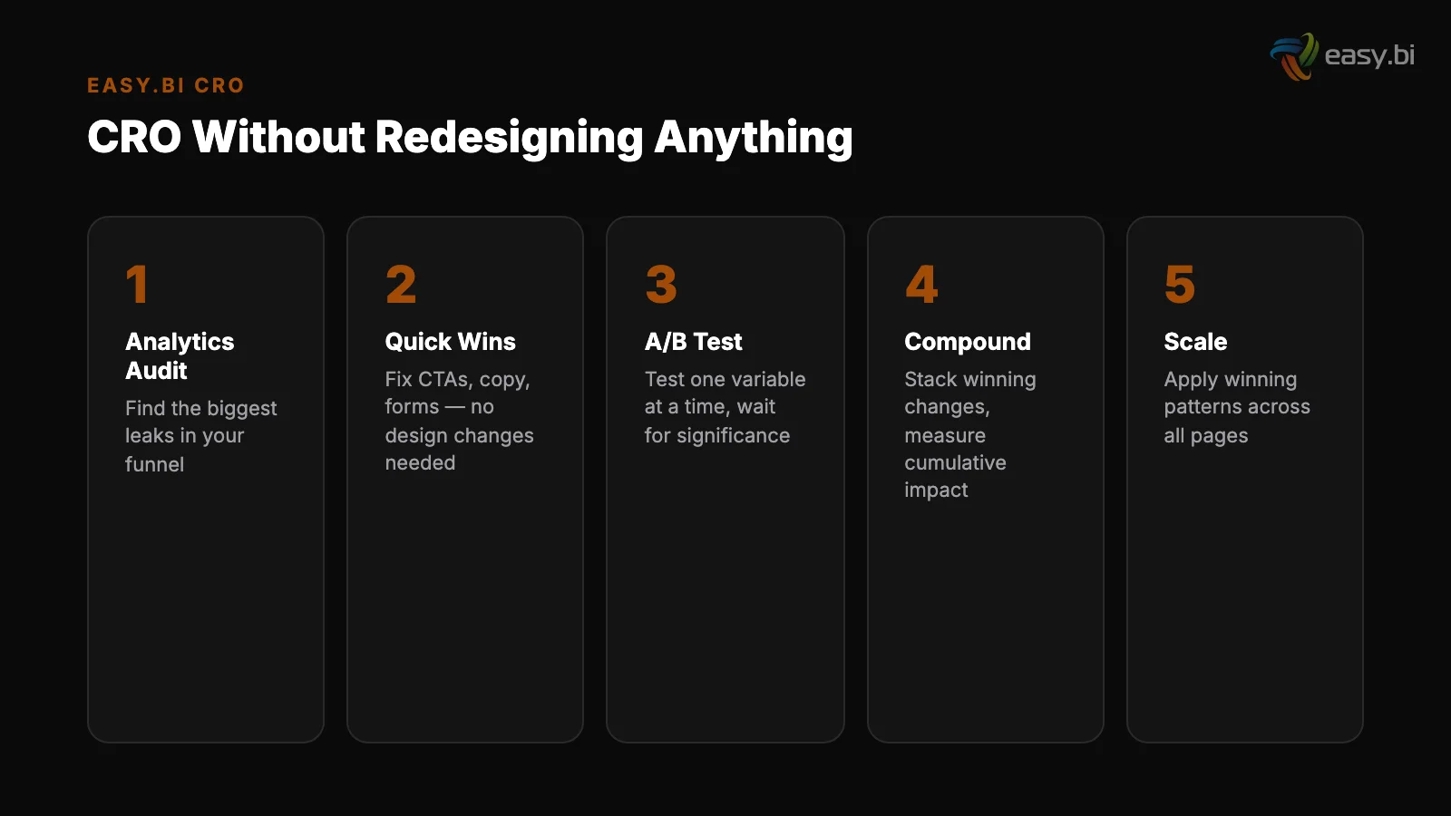
This article covers 7 categories of quick wins that improve conversion rates without any visual redesign. Each one can be implemented in days, tested in weeks, and measured against revenue in the next reporting cycle.
Why Quick Wins Beat Redesigns for CRO
The math is straightforward. Full-page redesigns succeed only 20% of the time. Iterative optimization outperforms radical redesign in 4 out of 5 cases. The reason is risk concentration: a redesign changes everything at once, making it impossible to isolate what helped and what hurt.
Quick wins change one variable at a time, so every improvement is measurable and reversible.
Consider the cost comparison:
| Approach | Typical Cost | Timeline | Success Rate | Measurability |
|---|---|---|---|---|
| Full redesign | EUR 80,000-200,000 | 4-6 months | 20% | Low — too many variables changed |
| Iterative quick wins | EUR 5,000-20,000 | 2-4 weeks per cycle | 60-80% | High — one variable per test |
| Combined (audit then optimize) | EUR 15,000-40,000 | 6-8 weeks | 70-85% | High — structured experimentation |
The average website conversion rate across industries is 2.35%, with the top 25% converting at 5.31% or higher [1]. The gap between average and top quartile is closed through dozens of small, tested improvements — not through a single redesign event.
"The companies with the highest conversion rates didn't get there through one big redesign. They got there through 50 small experiments, each one validated with data, each one compounding on the last."
See how we deliver AI-powered efficiency gains.
Quick Win 1: Rewrite Your CTAs
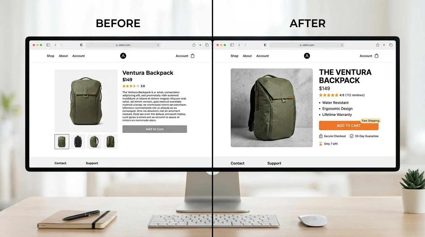
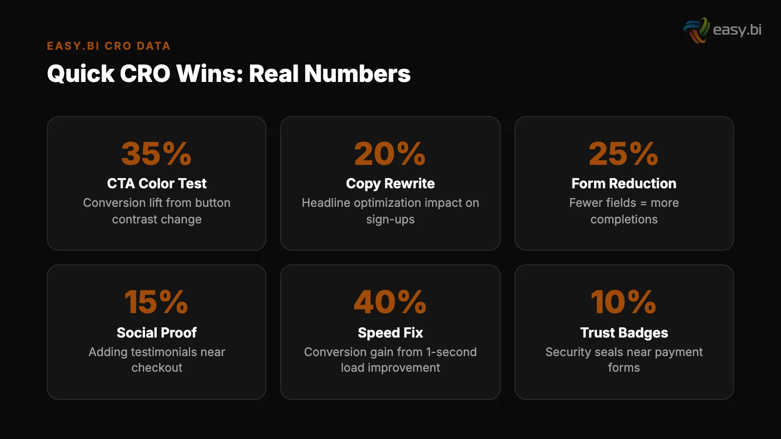
The words on your buttons matter more than the color. Personalized CTAs convert 202% better than default versions [2]. That is not a design change — it is a copy change that takes 10 minutes to implement.
The principles of high-converting CTAs:
Be specific about what happens next. "Submit" tells the user nothing. "Get your free audit report" tells them exactly what they receive. "Start my 14-day trial" is better than "Sign up" because it quantifies the commitment.
Use first-person language. "Start my free trial" outperforms "Start your free trial" in multiple documented A/B tests. First-person language creates a sense of ownership before the click.
Reduce perceived risk. "Book a call — no commitment" removes the fear of being sold to. "Try free for 14 days — no credit card" removes the fear of unexpected charges. Every CTA should answer the user's implicit question: "What will this cost me?"
Test relentlessly. Only 1 in 8 A/B tests produces statistically significant results, which means you need to test many variations. The teams that win at CRO are the ones that run the most experiments, not the ones with the best intuition.
Quick Win 2: Move Your Social Proof to Decision Points
Most websites have a testimonials page. Almost nobody visits it. Social proof elements on landing pages increase conversions by an average of 12.5%. The key is placement: social proof must appear near the moment of decision, not on a separate page.
Adding trust signals — security badges, testimonials, client logos, case study snippets — near CTAs can increase conversions by 42% [3]. This is a content placement change, not a design change. Move existing testimonials from the testimonials page to directly above or below your primary CTA.
Place client logos in the hero section. Add a mini case study result ("Increased conversion rate by 35% for REWE Group") next to your contact form.
Using real customer photos instead of stock images increases conversion by 35% [4]. If your testimonials currently use stock photos or no photos at all, replacing them with real customer headshots is a zero-design-cost improvement with measurable impact.
Quick Win 3: Cut Your Form Fields in Half
Forms are the single highest-friction element on most websites. Reducing form fields from 11 to 4 can increase conversions by up to 120% [5]. That makes form reduction the highest-ROI change most websites can make today.
The audit process is simple. For each field on your form, ask: "Do we need this information to fulfill the user's request?" For a demo request form, you need name, email, and company.
You do not need phone number, job title, company size, industry, budget range, and "how did you hear about us" — all of which can be collected after the initial conversion.
Clear inline error messages in forms reduce user drop-off by 22% [6]. If your forms show error messages only after submission (or worse, show a generic "something went wrong" error), adding inline validation is a quick technical improvement that directly reduces abandonment.
Progressive disclosure in forms improves completion rates by 20-40% [7]. If you cannot reduce the number of fields, break the form into steps. Show 3 fields at a time with a progress indicator. Users who commit to step 1 are significantly more likely to complete step 3.
How Does Copy Affect Conversion Without Changing Design?
Copy is the most underleveraged conversion lever because it requires no design or development resources. You can change a headline in your CMS in 5 minutes and have it live in production immediately.
B2B websites with clear value propositions above the fold convert up to 80% better than those without.
If your hero headline says "Welcome to [Company Name]" or "Driving Innovation Through Technology," replacing it with a specific outcome statement will move conversion rates. "Ship your SaaS product in weeks, not months" converts because it is specific, measurable, and speaks to a real pain point.
Users read only 20-28% of words on an average page [8]. That means long paragraphs of marketing copy are mostly unread. Converting those paragraphs into scannable bullet points, bold key phrases, and short sentences ensures the 20% of words that do get read are the ones that matter.
The copy changes that consistently lift conversion rates:
- Replace features with outcomes. "Advanced analytics dashboard" becomes "See which campaigns drive revenue in 30 seconds."
- Add numbers wherever possible. "Fast delivery" becomes "Results every 14 days." "Large team" becomes "50+ engineers across 4 countries."
- Address objections directly. If your users worry about price, say "No hidden fees. No setup costs. Cancel anytime." near the CTA.
- Use customer language. Pull exact phrases from support tickets, sales calls, and reviews. If customers say "I need to ship faster," your headline should say "ship faster" — not "accelerate time-to-market."
Quick Win 5: Fix Page Speed Without a Rebuild
A 1-second delay in page load time leads to a 7% reduction in conversions [9]. Pages loading within 2 seconds have an average bounce rate of 9%, while pages loading in 5 seconds see 38% [10]. These are not small differences.
Speed improvements deliver conversion gains immediately, with zero design changes required.
The fastest wins for page speed:
Compress and convert images
Compress and convert images. Switch from PNG/JPEG to WebP format. Implement responsive image sizing so mobile users don't download desktop-sized images. Lazy load below-the-fold images — this alone improves LCP by 25% on average [11].
Defer non-critical JavaScript. Analytics scripts, chat widgets, and marketing tags don't need to load before the page renders. Moving them to deferred or async loading keeps them functional while removing them from the critical rendering path.
Defer non-critical JavaScript
Enable browser caching. Returning visitors should not re-download your CSS, JavaScript, and logo on every page load. Proper cache headers reduce page load time for repeat visits by 60-80%.
Remove unused code. Most websites accumulate JavaScript libraries, CSS frameworks, and tracking scripts over time. Audit your page weight quarterly. Remove anything that doesn't serve a current business purpose.
Sites that meet Core Web Vitals thresholds see 24% fewer page abandonments [12]. Run Google PageSpeed Insights on your top 10 landing pages. The report gives you a prioritized list of technical improvements, each with an estimated performance gain. Start with the highest-impact items.
3x faster development with our ebiCore AI framework
Identify your top AI opportunities, validate with a PoC, and ship to production.
Start with a Strategy CallQuick Win 6: Optimize Above-the-Fold Content
Users spend 57% of their page-viewing time above the fold [13]. Whatever appears in that viewport without scrolling determines whether the user engages or bounces. Optimizing above-fold content requires no redesign — it requires rearranging existing elements.
The above-fold checklist:
- Is the value proposition visible? Not your company name. Not your navigation. The specific reason this page exists for this visitor.
- Is the primary CTA visible? If users have to scroll to find the action you want them to take, many of them never will.
- Is there social proof? A client logo bar, a key statistic, or a mini-testimonial — something that validates your claim within the first viewport.
- Is the above-fold content uncluttered? Removing unnecessary elements from above the fold is the opposite of a redesign — it is a simplification. Removing unnecessary navigation from landing pages can boost conversion by 28-40% [14].
Quick Win 7: Deploy Exit-Intent Recovery
Exit-intent popups recover 10-15% of otherwise lost visitors [15]. They trigger when the user's cursor moves toward the browser's close button or back button, offering one final value exchange before the user leaves.
Exit-intent works because it targets users who have already decided to leave — there is no downside. The popup either recovers the visit or is ignored by someone who was already gone.
The key to effective exit-intent is relevance. A generic "Wait! Don't go!" popup converts poorly.
A specific offer tied to the page content converts well: "Download the full UX audit checklist (PDF)" on a blog post about UX audits. "Get a personalized demo" on a product page. "See pricing for your team size" on the pricing page.
Companies running 12+ experiments per year see 2-3x better conversion improvements. Exit-intent optimization should be part of that experimentation cadence — test different offers, different triggers, and different page placements to find what works for your specific audience.
Where to Start: Prioritizing Quick Wins by Impact
Not all quick wins are equal. Here is the recommended priority order based on typical conversion impact and implementation effort:
- Form field reduction — highest ROI, lowest effort. Can be done in an afternoon.
- CTA copy rewrite — immediate impact, zero technical requirements.
- Social proof relocation — move existing content to decision points.
- Page speed optimization — image compression and script deferral deliver measurable gains within days.
- Above-fold content optimization — rearrange existing elements for clarity.
- Body copy revision — replace feature language with outcome language.
- Exit-intent deployment — requires a tool (OptinMonster, Unbounce, etc.) but delivers incremental recovery.
Each of these changes can be A/B tested independently. Run one test at a time, measure for a full business cycle (minimum 2 weeks), and roll out winners before starting the next test.
This systematic approach is part of the broader data-driven UX system that connects research, experimentation, and measurement into a continuous improvement cycle.
If you want structured CRO support without a full redesign, explore our UX Growth services. We specialize in the kind of targeted, data-driven optimization that moves conversion rates through evidence, not opinion.
References
- [1] WordStream, "What Is a Good Conversion Rate?" — The average website conversion r Source
- [2] HubSpot, "Personalized Calls to Action" — Personalized CTAs convert 202% better
- [3] Econsultancy, "Conversion Rate Optimization Report" — Adding trust signals near Source
- [4] VWO — Using real customer photos instead of stock images increases conversion by Source
- [5] HubSpot, "Form Fields and Landing Page Conversions" — Reducing form fields from Source
- [6] Baymard Institute, "Form Field Validation" — Clear inline error messages in form
- [7] Nielsen Norman Group, "Progressive Disclosure" — Progressive disclosure in forms Source
- [8] Nielsen Norman Group, "F-Shaped Pattern Reading Web Content" — Users read only 2 Source
- [9] Akamai — A 1-second delay in page load time leads to a 7% reduction in conversio Source
- [10] Pingdom — Pages loading within 2 seconds have an average bounce rate of 9%, whil Source
- [11] Google / web.dev — Lazy loading below-the-fold images improves Largest Contentfu Source
- [12] Google / web.dev, "Vitals Business Impact" — Sites that meet Core Web Vitals thr Source
- [13] Nielsen Norman Group, "Scrolling and Attention" — Users spend 57% of their page- Source
- [14] Unbounce — Removing unnecessary navigation from landing pages can boost conversi Source
- [15] OptinMonster — Exit-intent popups recover 10-15% of otherwise lost visitors. Source
Explore Other Topics
Ready to unlock AI-driven efficiency?
30-minute call with an engineering lead. No sales pitch - just honest answers about your project.
98% engineer retention · 14-day delivery sprints · No lock-in contracts
Related Reading

How to Integrate Different Company Systems Without Huge Costs?
Fragmented data collection limits comprehensive insights, emphasizing the need for integrated systems to enhance data analysis and decision-making.
Andrej Lovsin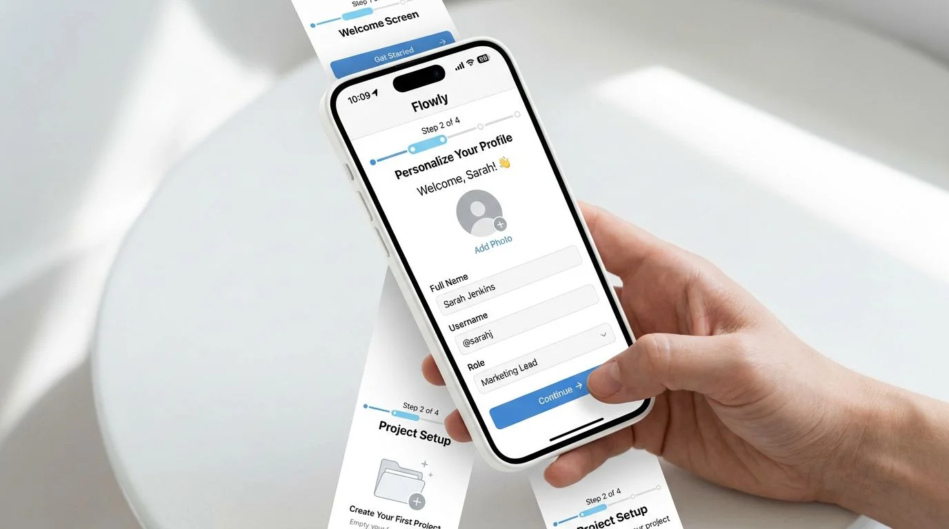
The Activation Rate Problem: Why Your Users Sign Up and Disappear
Most SaaS products lose 40-60% of new signups within the first week. Learn why activation rate is the growth metric most teams ignore — and how to fix it with data-driven UX.
Timo Koerner
Why Your E-Commerce Analytics Are Lying to You (And How to Fix It)
Most DACH e-commerce teams make decisions on incomplete data. Learn why GA4 alone is not enough, how consent rates distort your numbers, and how to build a 4-tool analytics stack that shows what is actually happening in your store.
Timo Koerner