
The UX Audit Checklist: 30 Things to Fix Before You Redesign
Table of Contents+
- Navigation: Can Users Find What They Need?
- Forms: Are You Losing Revenue at the Point of Conversion?
- Performance: Is Speed Killing Your Conversions?
- Mobile: Does Your Mobile Experience Convert?
- Accessibility: Are You Excluding 15% of Your Market?
- Visual Hierarchy: Does Your Layout Guide Users to Action?
- How to Use This Checklist
- References
TL;DR
The instinct when conversion rates stall is to redesign everything. New layout. New color palette. New information architecture. Six months and EUR 150,000 later, conversion rates are flat — or worse.
Key Takeaways
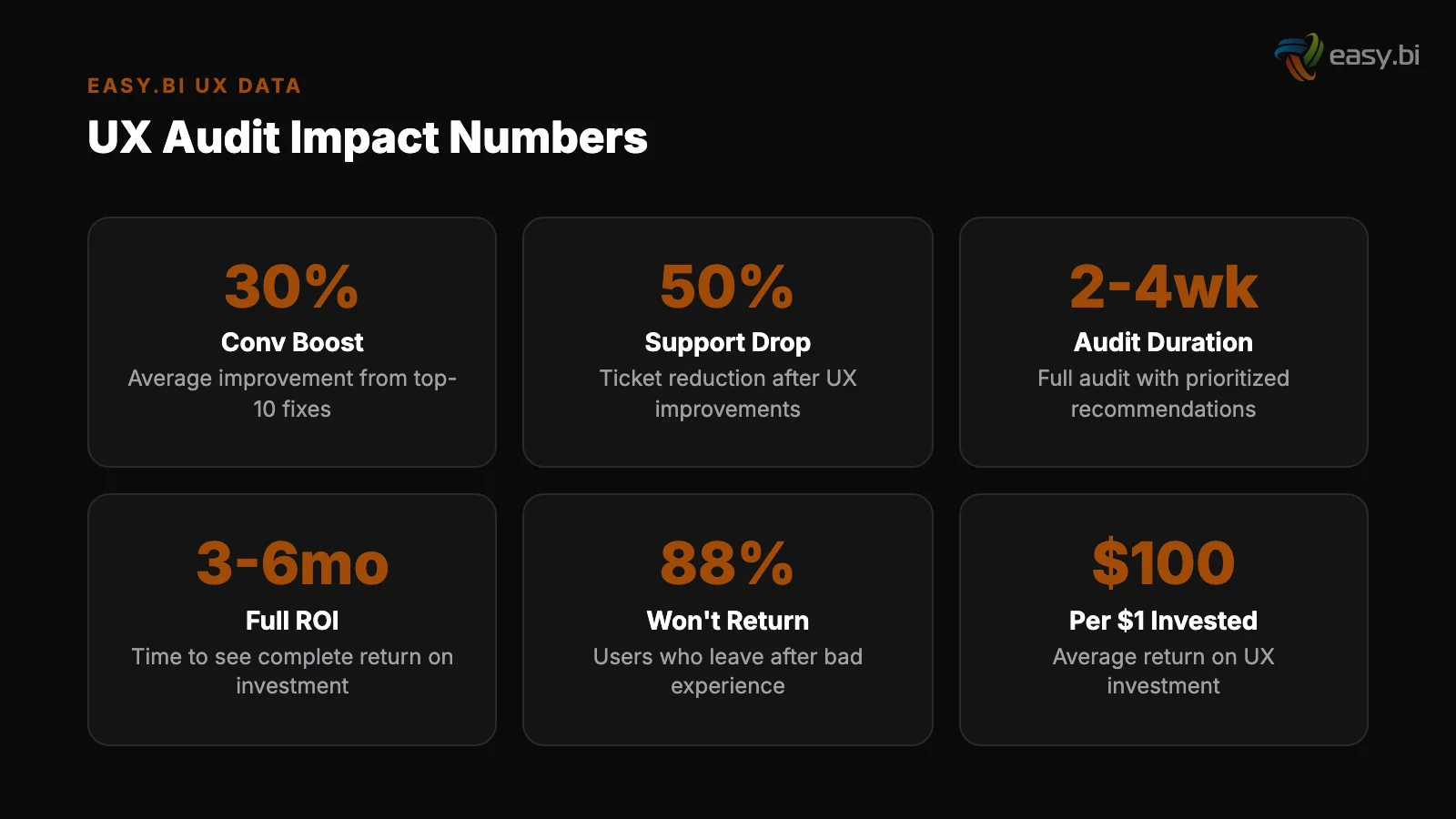
- •Full-page redesigns succeed only 20% of the time — iterative optimization outperforms radical redesign in 4 out of 5 cases.
- •This 30-item checklist covers the 6 categories that account for 90% of UX-driven revenue loss: navigation, forms, performance, mobile, accessibility, and visual hierarchy.
- •96.3% of home pages have detectable WCAG 2 accessibility failures, with an average of 56.8 errors per page — fixing these expands your addressable market by up to 20%.
- •A 1-second delay in page load time leads to a 7% reduction in conversions, and pages loading in 5 seconds see a 38% bounce rate versus 9% for pages loading in 2 seconds.
- •Reducing form fields from 11 to 4 can increase conversions by up to 120% — forms are where most websites lose the most revenue with the least effort to fix.
Before spending EUR 100K+ on a redesign, fix these 30 UX issues first. A structured audit checklist covering navigation, forms, performance, mobile, accessibility, and visual hierarchy.
The instinct when conversion rates stall is to redesign everything. New layout. New color palette. New information architecture. Six months and EUR 150,000 later, conversion rates are flat — or worse.
Full-page redesigns succeed only 20% of the time. Iterative optimization outperforms radical redesign in 4 out of 5 cases. The reason: most conversion problems are not caused by how your site looks.
They are caused by specific, fixable UX issues hiding in your navigation, forms, performance, mobile experience, accessibility, and visual hierarchy.
This checklist covers 30 issues grouped into 6 categories. Fix these first. If your conversion rate still underperforms after addressing them, then you have earned the right to consider a redesign — armed with data about what actually needs to change.
Navigation: Can Users Find What They Need?
Navigation is the skeleton of your site. When it fails, every page downstream suffers. Users who can't find what they came for don't try harder — they leave. 88% of online consumers are less likely to return to a site after a bad experience [1].
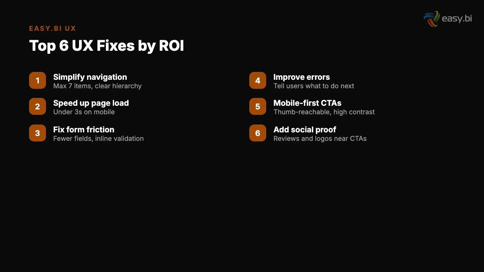
1. Primary navigation has 7 or fewer top-level items. Cognitive load research consistently shows that humans process 5-9 items effectively. More than 7 top-level navigation items creates decision paralysis. If your nav has 12 items, consolidate.
1. Primary navigation has 7 or fewer top-level items
2. Breadcrumb navigation is present on all pages beyond the homepage. Breadcrumbs increase task success rates by 35-45% on complex websites [2]. They cost almost nothing to implement and provide orientation on every page.
3. Search is visible and functional. If your site has more than 50 pages, search is not optional. Test it with your top 20 user queries. If the first result isn't relevant for any of them, your search is broken.
3. Search is visible and functional
4. Navigation labels use user language, not internal jargon. "Solutions" means nothing. "E-Commerce Development" is specific. Test your labels with 5 users from your target audience — if they can't predict what's behind the label, change it.
5. The navigation works on sticky/fixed headers. Sticky navigation bars increase findability by 22% and reduce time to navigate by 36% [3]. If your header disappears on scroll, users who want to navigate mid-page have to scroll back to the top.
See how we deliver AI-powered efficiency gains.
Forms: Are You Losing Revenue at the Point of Conversion?
Forms are where intent turns into action — or where it dies. Every unnecessary field, confusing label, and missing validation message is revenue walking out the door.
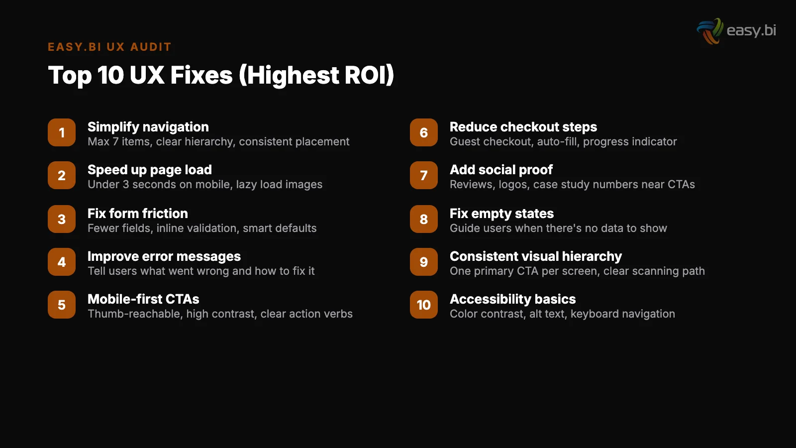
6. Forms have the minimum number of fields required. Reducing form fields from 11 to 4 can increase conversions by up to 120% [4]. Audit every field: does the business need this information at this moment, or can it be collected later?
6. Forms have the minimum number of fields required
7. Inline validation provides real-time feedback. Clear inline error messages in forms reduce user drop-off by 22% [5]. If users have to submit the form to discover errors, you are creating unnecessary friction.
8. Multi-step forms are used for complex data collection. Multi-step forms outperform single-step forms by up to 300% for complex lead generation scenarios [6]. If your form has more than 5 fields, consider breaking it into logical steps with a progress indicator.
7. Inline validation provides real-time feedback
9. Form labels are above input fields, not beside them. Eye-tracking research shows that top-aligned labels reduce completion time by 50% compared to left-aligned labels. Every form on your site should follow this pattern consistently.
10. Submit buttons use specific action language. "Submit" is vague. "Get your free audit" or "Start your trial" is specific and reinforces the value exchange. Every submit button should tell the user exactly what happens next.
Performance: Is Speed Killing Your Conversions?
Speed is not a technical concern — it is a conversion lever. Users don't wait for slow pages. They leave, and they don't come back.
11. Pages load in under 3 seconds on mobile. 53% of mobile users abandon sites that take longer than 3 seconds to load [7]. Test your top 10 landing pages on a real mobile device over 4G. If any exceed 3 seconds, they are actively losing revenue.
11. Pages load in under 3 seconds on mobile
12. Largest Contentful Paint (LCP) is under 2.5 seconds. Sites that meet Core Web Vitals thresholds see 24% fewer page abandonments [8]. LCP measures when the largest visible content element finishes rendering. Hero images, featured product photos, and above-fold banners are typical culprits.
13. Cumulative Layout Shift (CLS) is below 0.1. CLS scores above 0.25 correlate with 15% higher bounce rates [9]. Layout shift happens when elements move after the page starts rendering — ads loading, images without dimensions, fonts swapping. Each shift erodes user trust.
12. Largest Contentful Paint (LCP) is under 2.5 seconds
14. Images are in modern formats with proper sizing. Serving unoptimized PNG files when WebP provides 25-35% size reduction at identical quality is a performance tax on every page load. Lazy loading below-the-fold images improves LCP by 25% on average [10].
15. Third-party scripts are audited and minimized. Every analytics tag, chat widget, and marketing pixel adds load time. Audit your third-party scripts quarterly. Remove anything not actively used. Defer everything that doesn't need to run before the page renders.
| Performance Metric | Good | Needs Improvement | Poor |
|---|---|---|---|
| LCP | Under 2.5s | 2.5-4.0s | Over 4.0s |
| INP | Under 200ms | 200-500ms | Over 500ms |
| CLS | Under 0.1 | 0.1-0.25 | Over 0.25 |
| Total page weight | Under 1MB | 1-3MB | Over 3MB |
| Time to interactive | Under 3.8s | 3.8-7.3s | Over 7.3s |
Mobile: Does Your Mobile Experience Convert?
Mobile traffic exceeds desktop for most websites. Yet mobile conversion rates average 1.53% compared to 4.14% on desktop [11]. That 63% gap is not inevitable — it is a design failure that can be systematically fixed.
16. Touch targets are at least 44x44 pixels. Apple's Human Interface Guidelines and Google's Material Design both specify minimum touch targets. If your buttons, links, or form fields are smaller, mobile users are misclicking and getting frustrated.
16. Touch targets are at least 44x44 pixels
17. No horizontal scrolling exists on any page. Horizontal scroll on mobile breaks the user's mental model. It happens when images, tables, or fixed-width elements exceed the viewport. Test every page type at 375px width (iPhone SE) — the smallest common viewport.
18. Text is readable without zooming. Body text below 16px on mobile requires zooming, which disrupts the reading flow. Check that your base font size is 16px or larger, and that line length stays under 80 characters on mobile viewports.
17. No horizontal scrolling exists on any page
19. The mobile checkout or conversion flow requires 3 steps or fewer. Every additional step in a mobile conversion flow loses 10-20% of users. Simplifying checkout to a single page can increase conversions by up to 21.8% [12].
Audit your mobile flow step by step, and eliminate or combine wherever possible.
20. Responsive design is implemented (not a separate mobile site). Responsive design increases mobile conversion rates by 11% compared to separate mobile sites [13]. A single responsive codebase ensures consistent behavior, easier maintenance, and better SEO.
Accessibility: Are You Excluding 15% of Your Market?
Accessibility failures exclude users with disabilities, degrade the experience for everyone else, and create legal liability under the European Accessibility Act (EAA). 96.3% of home pages have detectable WCAG 2 accessibility failures, with an average of 56.8 errors per page [14].
21. All images have descriptive alt text. Screen readers announce images by their alt attribute. Missing or empty alt text makes visual content invisible to users with visual impairments — and to search engines. Every image should describe what is shown and why it matters in context.
21. All images have descriptive alt text
22. Color contrast meets WCAG AA standards (4.5:1 for body text). Insufficient contrast affects users with low vision, color blindness, and anyone reading in bright sunlight or on a cheap monitor. Test with WebAIM's contrast checker — it takes 30 seconds per color combination.
23. All interactive elements are keyboard-accessible. Users who navigate with keyboards, switch devices, or screen readers must be able to reach and operate every button, link, form field, and modal. Tab through your entire site without touching the mouse.
If you get stuck anywhere, it is a keyboard trap that blocks access.
24. Form fields have associated labels. A form field without a programmatic label is invisible to screen readers. The user hears "edit text" instead of "Email address." Every input needs a <label> element with a matching for attribute.
23. All interactive elements are keyboard-accessible
25. Heading hierarchy is logical (h1 through h6 in order). Screen reader users navigate by headings. Skipping from h1 to h4, or using headings for visual styling rather than semantic structure, breaks this navigation pattern. Every page should have exactly one h1, and headings should nest logically.
"Accessibility is not a feature you add later. It is a quality of your design system that either exists from the beginning or costs 10x more to retrofit. Improving accessibility can increase an e-commerce site's customer base by up to 20%."
3x faster development with our ebiCore AI framework
Identify your top AI opportunities, validate with a PoC, and ship to production.
Start with a Strategy CallVisual Hierarchy: Does Your Layout Guide Users to Action?
Visual hierarchy determines what users see first, second, and third. When hierarchy is weak, users scan randomly, miss the CTA, and leave without converting. When hierarchy is strong, users follow a visual path that ends at the action you want them to take.
26. Every page has a single, clear primary CTA. If a page has 4 buttons of equal visual weight, none of them is the primary action. One CTA should dominate. Everything else should be secondary or tertiary. Adding trust signals near CTAs can increase conversions by 42% [15].
26. Every page has a single, clear primary CTA
27. The value proposition is visible above the fold. B2B websites with clear value propositions above the fold convert up to 80% better than those without. Users spend 57% of their page-viewing time above the fold [16].
If your value proposition requires scrolling to find, most visitors will never see it.
28. F-pattern and Z-pattern layouts match content type. Users read 20-28% of words on an average page, following an F-shaped reading pattern on text-heavy pages [17]. Place your most important content along the F-pattern's hotspots: the top horizontal bar, the secondary horizontal bar, and the left vertical rail.
27. The value proposition is visible above the fold
29. White space is used intentionally to group related elements. Cramming content edge-to-edge creates visual noise. White space is not wasted space — it is grouping information, directing attention, and giving the eyes a resting point between content blocks. Every section should have clear visual boundaries.
30. Social proof is placed near decision points, not isolated in a testimonials page. Social proof elements on landing pages increase conversions by an average of 12.5%.
Testimonials, client logos, and case study references should appear within scrolling distance of CTAs — not buried on a separate page that nobody visits.
How to Use This Checklist
Do not try to fix all 30 items simultaneously. Prioritize by revenue impact:
Week 1-2: Forms and Performance. These two categories have the most direct impact on conversion rates. A 1-second delay in page load time leads to a 7% reduction in conversions [18]. Form field reduction alone can lift conversion rates by double digits.
Week 1-2: Forms and Performance
Week 3-4: Navigation and Visual Hierarchy. These determine whether users reach your conversion points at all. If users can't find the page, form optimization doesn't matter.
Week 5-6: Mobile and Accessibility. These expand your addressable market. The 63% mobile conversion gap and the 15% disability market represent revenue you are currently losing by default.
Week 3-4: Navigation and Visual Hierarchy
Run a UX audit using this checklist before committing to any redesign. In most cases, fixing the specific issues uncovered here delivers more conversion lift than a full redesign — at 10-20% of the cost and in a fraction of the time.
This checklist is part of the data-driven UX system that connects research, experimentation, and measurement into a continuous improvement cycle. The audit is step one. Experimentation — testing fixes, measuring results, iterating — is what turns findings into revenue.
If you want a structured UX audit of your product or website, explore our UX Growth services. We apply this checklist — and go deeper — across every client engagement.
References
- [1] Toptal / Gomez Report — 88% of online consumers are less likely to return to a s Source
- [2] Nielsen Norman Group, "Breadcrumbs" — Breadcrumb navigation increases task succe Source
- [3] Smashing Magazine / usability study — Sticky navigation bars increase findabilit Source
- [4] HubSpot, "Form Fields and Landing Page Conversions" — Reducing form fields from Source
- [5] Baymard Institute, "Form Field Validation" — Clear inline error messages in form
- [6] Venture Harbour — Multi-step forms outperform single-step forms by up to 300% fo
- [7] Google / Think with Google — 53% of mobile users abandon sites that take longer Source
- [8] Google / web.dev, "Vitals Business Impact" — Sites that meet Core Web Vitals thr Source
- [9] Google Chrome UX Report — Cumulative Layout Shift (CLS) scores above 0. Source
- [10] Google / web.dev — Lazy loading below-the-fold images improves Largest Contentfu Source
- [11] Statista — Mobile conversion rates average 1.53% compared to 4. Source
- [12] Baymard Institute, "Checkout Usability" — Simplifying checkout to a single page Source
- [13] Google / Think with Google — Responsive design increases mobile conversion rates Source
- [14] WebAIM Million — 96.3% of home pages have detectable WCAG 2 accessibility failur Source
- [15] Econsultancy, "Conversion Rate Optimization Report" — Adding trust signals near Source
- [16] Nielsen Norman Group, "Scrolling and Attention" — Users spend 57% of their page- Source
- [17] Nielsen Norman Group, "F-Shaped Pattern Reading Web Content" — Users read only 2 Source
- [18] Akamai — A 1-second delay in page load time leads to a 7% reduction in conversio Source
Explore Other Topics
Ready to unlock AI-driven efficiency?
30-minute call with an engineering lead. No sales pitch - just honest answers about your project.
98% engineer retention · 14-day delivery sprints · No lock-in contracts
Related Reading

Why Your E-Commerce Analytics Are Lying to You (And How to Fix It)
Most DACH e-commerce teams make decisions on incomplete data. Learn why GA4 alone is not enough, how consent rates distort your numbers, and how to build a 4-tool analytics stack that shows what is actually happening in your store.
Timo Koerner
Why Your Dashboard Confuses Users (And How to Fix It in a Sprint)
Most enterprise dashboards overwhelm users with data instead of enabling decisions. Learn how to fix information overload, build KPI hierarchies, choose the right charts, and apply progressive disclosure - with a sprint-scoped playbook and lessons from a Siemens dashboard redesign.
Timo Koerner
Accessibility as a Business Advantage, Not a Compliance Checkbox
Accessibility is not a legal obligation to minimize - it is a market expansion strategy. Learn how the European Accessibility Act affects your products, why 15% of your potential customers have disabilities, and quick wins you can ship this week to improve both accessibility and SEO.
Timo Koerner