The Activation Rate Problem: Why Your Users Sign Up and Disappear
Table of Contents+
- What Makes Activation Rate Different from Other Metrics?
- Why Do Users Sign Up and Disappear?
- How Do You Find Your Real Activation Moment?
- Which UX Changes Move Activation Rate the Most?
- How Do You Build an Activation Experimentation Program?
- What Does the Activation Funnel Look Like in Practice?
- How Does Activation Rate Connect to Revenue?
- Where Activation Rate Fits in the Data-Driven UX System
- References
TL;DR
You spent EUR 50,000 on paid acquisition last quarter. Your signup numbers look healthy. But when you check 30-day retention, the picture falls apart: 60% of those new users never completed a single meaningful action inside your product. They signed up, looked around, and left.
Key Takeaways
- •Activation rate — the percentage of new users who reach a key value moment — is the single most underleveraged growth metric in SaaS.
- •Most products lose 40-60% of signups in the first 7 days because time-to-value is too long and onboarding creates friction instead of removing it.
- •Reducing form fields from 11 to 4 can increase completion rates by up to 120%, and personalized CTAs convert 202% better than generic defaults.
- •Progressive disclosure in onboarding flows improves completion rates by 20-40% by showing users only what they need at each step.
- •Companies running 12+ experiments per year on activation flows see 2-3x better conversion improvements than those running fewer tests.
Most SaaS products lose 40-60% of new signups within the first week. Learn why activation rate is the growth metric most teams ignore — and how to fix it with data-driven UX.
You spent EUR 50,000 on paid acquisition last quarter. Your signup numbers look healthy. But when you check 30-day retention, the picture falls apart: 60% of those new users never completed a single meaningful action inside your product. They signed up, looked around, and left.
This is the activation rate problem. It sits between acquisition and retention in the growth funnel, and most teams ignore it completely. They pour budget into getting users through the door while the floor between the door and the product's core value is covered in friction.
Activation rate measures the percentage of new users who complete a key action that predicts long-term retention.
For a project management tool, that might be "created first project." For an analytics platform, "connected first data source." For an e-commerce SaaS, "processed first order." The specific action varies, but the principle is universal: users who reach the value moment stay. Users who don't, churn.
This article breaks down why activation fails, how to diagnose it, and the specific UX changes that move the metric — based on research data and patterns from real SaaS optimization projects.
What Makes Activation Rate Different from Other Metrics?
Acquisition measures how many people show up. Retention measures how many stay. Activation measures whether they ever experienced the reason they signed up in the first place.
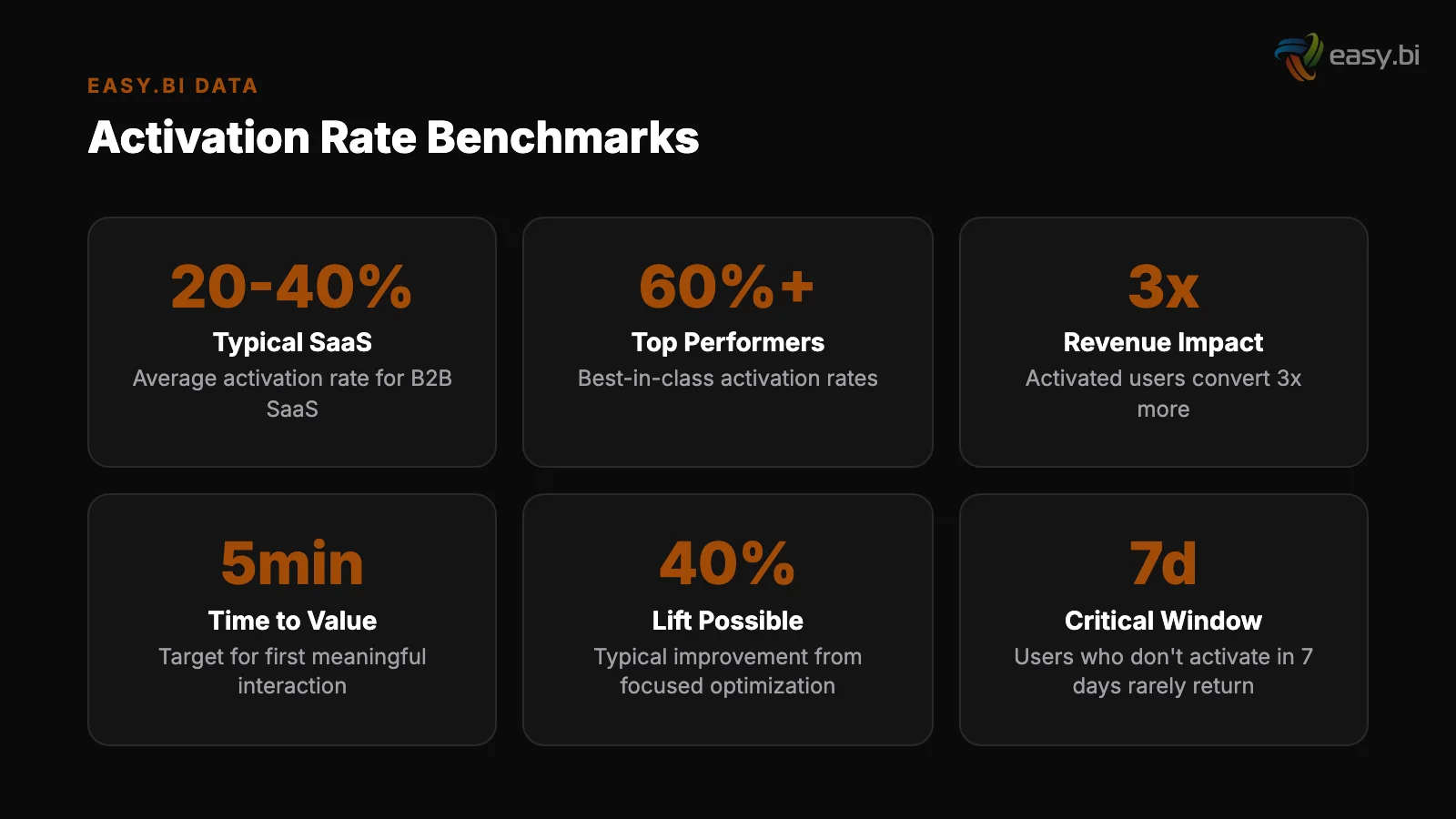
The distinction matters because you can have strong acquisition and decent retention numbers while losing the majority of potential revenue in the middle. A SaaS product with 10,000 monthly signups and a 25% activation rate is leaving 7,500 users on the table every month.
Improve activation to 50%, and you double your active user base without spending a single euro more on marketing.
SaaS landing pages convert at a median of 3.0%, with top performers reaching 11.7% [1]. That gap between median and top quartile is not just about better ad copy or smarter targeting. It extends into the post-signup experience.
The best-performing products convert visitors into signups and then convert signups into activated users through a seamless flow.
"Activation is where product-market fit becomes measurable. If users sign up but never activate, you don't have a retention problem — you have a value delivery problem."
See how we deliver AI-powered efficiency gains.
Why Do Users Sign Up and Disappear?
The reasons fall into 5 categories, and most products suffer from at least 3 simultaneously:
1. Time-to-value is too long. Every screen, form field, and configuration step between signup and the first value moment is a potential exit point. If your product requires 15 minutes of setup before a user sees any benefit, you will lose the majority of signups.
Users form a first impression of a website in 50 milliseconds [2]. That same impatience applies to product onboarding. If the first 60 seconds don't demonstrate value, most users are gone.
1. Time-to-value is too long
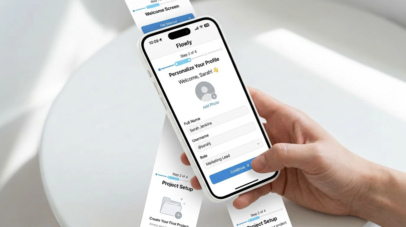
2. The onboarding flow asks for too much, too soon. Requiring users to fill out company details, invite team members, connect integrations, and configure preferences before they can do anything useful creates abandonment. Reducing form fields from 11 to 4 can increase conversions by up to 120% [3].
The same principle applies to onboarding: defer everything that isn't essential to reaching the activation moment.
3. The activation moment is undefined or wrong. Many teams assume they know what activation looks like. They define it as "completed profile" or "logged in 3 times" — metrics that feel meaningful but don't correlate with retention.
The real activation moment is the action that statistically predicts whether a user will be active 90 days later. Finding it requires cohort analysis, not guesswork.
2. The onboarding flow asks for too much, too soon
4. The product doesn't guide users toward value. Users land on a blank dashboard with a sidebar containing 12 menu items and no indication of where to start.
Without guidance, they click around randomly, fail to find value, and leave. 88% of online consumers are less likely to return to a site after a bad experience [4] — and a confusing first session counts as a bad experience.
5. Mobile onboarding is an afterthought. Mobile conversion rates average 1.53% compared to 4.14% on desktop [5]. If your signup flow works on mobile but your onboarding doesn't, you lose a growing segment of users before they ever activate.
How Do You Find Your Real Activation Moment?
The activation moment is not something you decide in a meeting. It is something you discover in your data. Here is the process:
Step 1: Pull retention cohorts. Separate users who are still active at 90 days from users who churned in the first 30 days. Look at what the retained users did in their first session and first week that the churned users did not.
Step 1: Pull retention cohorts
Step 2: Identify candidate actions. List every action a user can take in the first 7 days. For each action, calculate the correlation between completing that action and being retained at 90 days. The action with the highest correlation is your activation moment.
Step 3: Validate with timing data. How quickly do retained users reach the activation moment? If the median time-to-activation for retained users is 4 minutes, but your onboarding flow takes 20 minutes to reach that point, you have a clear design problem.
Step 2: Identify candidate actions
Step 4: Set your baseline. Measure the current activation rate — the percentage of all new signups who complete the activation moment within 7 days. This is the number you will optimize against.
| Metric | Weak Activation | Average Activation | Strong Activation |
|---|---|---|---|
| Activation rate (7-day) | Below 20% | 20-40% | Above 40% |
| Time to activation | Over 24 hours | 1-24 hours | Under 1 hour |
| Onboarding completion | Below 30% | 30-60% | Above 60% |
| Day-1 return rate | Below 15% | 15-30% | Above 30% |
| Feature adoption (first session) | 1 feature | 2-3 features | 4+ features |
5 user tests uncover approximately 85% of usability problems [6]. Run usability tests specifically on the signup-to-activation flow. Watch where users hesitate, where they get confused, and where they give up. Combine this qualitative data with the quantitative cohort analysis, and you will know exactly what to fix.
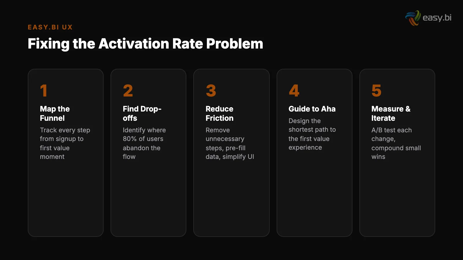
Which UX Changes Move Activation Rate the Most?
The highest-impact changes fall into 3 categories: reducing friction, adding guidance, and accelerating value.
Reducing friction. Every unnecessary step between signup and activation is a leak. Remove optional fields from the signup form. Defer team invitations, billing setup, and profile completion until after the user has activated. Progressive disclosure in forms improves completion rates by 20-40% [7].
Apply this principle to your entire onboarding: show only what the user needs at this moment, hide everything else.
Reducing friction
Adding guidance. Empty states and blank dashboards kill activation. Replace them with onboarding checklists, contextual tooltips, and guided tours that point users toward the activation moment. Personalized CTAs convert 202% better than default versions [8].
This applies directly to onboarding: "Create your first project" converts better than a generic "Get started" button because it is specific, actionable, and tied to the activation moment.
Accelerating value. Pre-populate the product with sample data so users can see what a "working" state looks like before they invest their own data. Offer templates instead of blank canvases. Show the outcome before asking for the input.
Users spend 57% of their page-viewing time above the fold [9] — in a product context, this means the first screen after signup must immediately demonstrate value or clearly show the path to it.
How Do You Build an Activation Experimentation Program?
Activation optimization is not a one-time project. It is a continuous experimentation program that runs alongside feature development. Companies running 12+ experiments per year see 2-3x better conversion improvements. The same principle applies to activation: systematic testing outperforms one-off redesigns.
A structured activation experimentation program follows this cadence:
Week 1-2: Baseline and research
Week 1-2: Baseline and research. Measure current activation rate. Run 5 usability tests on the signup-to-activation flow. Analyze heatmaps and session recordings. 64% of CRO professionals use heatmaps as their primary qualitative research tool [10] — they work equally well for product onboarding analysis.
Week 3-4: First experiment. Target the single biggest friction point identified in research. Run an A/B test with proper sample sizing. Only 1 in 8 A/B tests produces statistically significant results, so set realistic expectations and plan for a high-velocity testing cadence rather than betting on one big win.
Week 3-4: First experiment
Week 5-8: Iteration cycle. Run 2-3 more experiments based on findings from the first. Each experiment should have a clear hypothesis, a measurable outcome tied to activation rate, and a defined minimum sample size.
Ongoing: 14-day experiment sprints. Integrate activation testing into your regular development sprint cycle. Every sprint should include at least one activation-related experiment or research activity. Track results in a shared dashboard visible to product, engineering, and marketing.
3x faster development with our ebiCore AI framework
Identify your top AI opportunities, validate with a PoC, and ship to production.
Start with a Strategy CallWhat Does the Activation Funnel Look Like in Practice?
Here is a real-world activation funnel with typical drop-off rates at each stage:
| Funnel Stage | Typical Drop-off | Optimization Lever |
|---|---|---|
| Landing page to signup | 95-97% | Value proposition clarity, social proof, form reduction |
| Signup to email verification | 15-25% | Skip verification for first session, use magic links |
| Email verification to first login | 10-20% | Immediate redirect after verification, welcome email timing |
| First login to setup completion | 30-50% | Progressive disclosure, defer non-essential setup |
| Setup completion to activation moment | 20-40% | Guided tours, templates, pre-populated data |
The cumulative effect is dramatic. If you start with 1,000 signups and lose the industry-average percentage at each stage, only 150-250 users reach the activation moment. That is a 75-85% loss rate between signup and value delivery. Even modest improvements at each stage compound into significant activation gains.
How Does Activation Rate Connect to Revenue?
The revenue impact of activation rate improvement is direct and compounding. Every percentage point increase in activation rate means more users reach the value moment, which means more users convert to paid plans, which means higher lifetime value and lower cost per acquisition.
Consider a SaaS product with 5,000 monthly signups, a 25% activation rate, and a 30% conversion rate from activated users to paid plans. That produces 375 new paying customers per month.
Improve activation rate to 40%, and you produce 600 new paying customers — a 60% increase in revenue growth without changing anything about acquisition or pricing.
Every $1 invested in UX returns $100 [11]. Activation rate optimization is where that ROI is most concentrated, because it sits at the narrowest point of the funnel — the moment where a user either finds value or doesn't. Every improvement here multiplies through the rest of the funnel.
"You don't need more signups. You need more of your signups to reach the moment where they understand why they signed up. That is the activation problem, and fixing it is the highest-ROI investment in your growth stack."
Where Activation Rate Fits in the Data-Driven UX System
Activation rate optimization is one component of a broader data-driven UX system that connects research, experimentation, and measurement into a continuous improvement cycle. The same methodology — hypothesis, test, measure, iterate — applies to every stage of the user journey, from first visit to long-term retention.
The activation rate problem is urgent because it sits at the highest-leverage point in the funnel. Fix it first, and every other optimization effort produces better returns because more users are reaching the product's core value.
If your activation rate is below 30% and you want a structured approach to improving it, explore our UX Growth services. We apply the same 14-day sprint methodology to activation optimization that we use across 100+ projects — research, hypothesis, test, measure, iterate.
References
- [1] Unbounce Conversion Benchmark Report — SaaS landing pages convert at a median of Source
- [2] Google Research / Lindgaard et al. Source
- [3] HubSpot, "Form Fields and Landing Page Conversions" — Reducing form fields from Source
- [4] Toptal / Gomez Report — 88% of online consumers are less likely to return to a s Source
- [5] Statista — Mobile conversion rates average 1.53% compared to 4. Source
- [6] Nielsen Norman Group, "Why You Only Need to Test with 5 Users" — 5 user tests un Source
- [7] Nielsen Norman Group, "Progressive Disclosure" — Progressive disclosure in forms Source
- [8] HubSpot, "Personalized Calls to Action" — Personalized CTAs convert 202% better
- [9] Nielsen Norman Group, "Scrolling and Attention" — Users spend 57% of their page- Source
- [10] Hotjar, "Conversion Rate Optimization" — 64% of CRO professionals use heatmaps a Source
- [11] Forrester Research, "The Six Steps for Justifying Better UX" — Every $1 invested Source
Explore Other Topics
Ready to unlock AI-driven efficiency?
30-minute call with an engineering lead. No sales pitch - just honest answers about your project.
98% engineer retention · 14-day delivery sprints · No lock-in contracts
Related Reading

Why 85% of AI Projects Fail Before Production
Data-driven analysis of why 85% of AI projects fail before production. Covers organizational, data, process, and partner-selection causes with a diagnostic checklist for mid-market CTOs in the DACH region.
Filip Kralj
Why Your Dashboard Confuses Users (And How to Fix It in a Sprint)
Most enterprise dashboards overwhelm users with data instead of enabling decisions. Learn how to fix information overload, build KPI hierarchies, choose the right charts, and apply progressive disclosure - with a sprint-scoped playbook and lessons from a Siemens dashboard redesign.
Timo Koerner
Mobile UX for B2B: Your Enterprise Users Are on Phones Now
Mobile conversion rates are 63% lower than desktop. B2B decision-makers now research, compare, and approve purchases on their phones. Learn how to close the mobile gap with responsive design, touch optimization, form reduction, and offline-first patterns.
Timo Koerner