
Design Systems for Enterprise: Siemens Case Study
Table of Contents+
- What Is a Design System, and What Is It Not?
- What Is the Business Case for Enterprise Design Systems?
- How Did Siemens Build a Unified UI Library?
- What Does Component Governance Look Like?
- What Are the Biggest Adoption Challenges?
- How Do You Measure Design System ROI?
- Where Design Systems Fit in the Data-Driven UX Approach
- References
TL;DR
Every enterprise with more than 5 development teams faces the same problem: inconsistent user interfaces. One team uses Material Design. Another team built custom components from scratch. A third team inherited a legacy Bootstrap implementation from 2018.
Key Takeaways
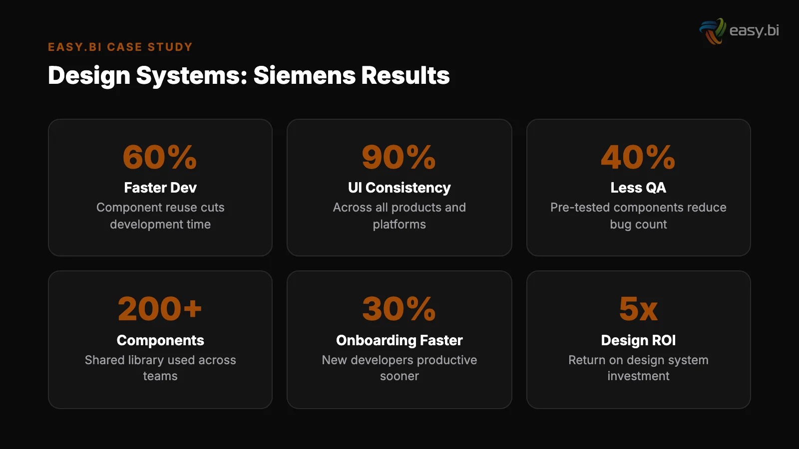
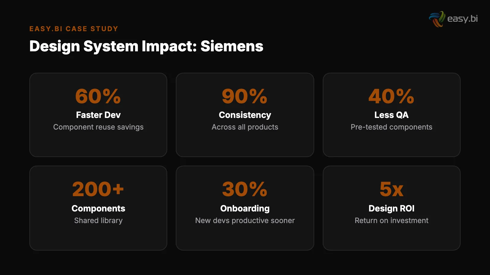
- •Design systems reduce design and development time by 25-50%, and companies with mature design systems report 47% faster time-to-market for new features.
- •Siemens built a unified UI library using Angular, Storybook, and Figma that standardized the user experience across dozens of internal applications and multiple development teams.
- •Component governance - who owns the system, how contributions are reviewed, and how breaking changes are communicated - determines whether a design system thrives or becomes shelfware.
- •The average developer spends 41% of their time on maintenance and technical debt rather than new feature development. A design system directly reduces this by eliminating redundant component creation.
- •Adoption is the hardest part. Without executive sponsorship, developer education, and measurable adoption KPIs, even well-built design systems fail within 18 months.
Design systems reduce development time by 25-50% and accelerate time-to-market by 47%. Learn how Siemens built a unified UI library with Angular, Storybook, and Figma - and the governance model that made it stick.
Every enterprise with more than 5 development teams faces the same problem: inconsistent user interfaces. One team uses Material Design. Another team built custom components from scratch. A third team inherited a legacy Bootstrap implementation from 2018.
The result is a fractured user experience, duplicated development effort, and a maintenance burden that grows with every new application.
Design systems solve this. Not in theory - in measurable, documented outcomes. Design systems reduce design and development time by 25-50% [1], and companies with mature design systems report 47% faster time-to-market for new features [2]. The ROI is not speculative. It compounds with every application that adopts the system.
This article covers what a design system actually is (and what it is not), the business case for investing in one, how Siemens approached this with a unified UI library built on Angular, Storybook, and Figma, the governance model that keeps it alive, and the adoption challenges that kill most design system initiatives before they deliver value.
What Is a Design System, and What Is It Not?
A design system is a collection of reusable components, guided by clear standards, that can be assembled to build any number of applications. It includes 3 layers:
Design tokens. The foundational values: colors, typography scales, spacing units, border radii, shadows. These are not stored in a Figma file that designers reference manually.
They are stored as code - CSS custom properties, JSON token files, or platform-specific variables - that both design tools and codebases consume from a single source of truth.
Design tokens
Component library. Pre-built, tested, accessible UI components: buttons, inputs, modals, navigation patterns, data tables, cards. Each component has defined states (default, hover, focus, disabled, error), responsive behavior, and accessibility compliance baked in.
The component library is the most visible part of a design system, but it is not the whole system.
Documentation and guidelines. Usage rules, pattern guidance, content standards, and contribution processes. Without documentation, a component library is just a code repository that developers may or may not discover, may or may not use correctly, and will eventually fork into incompatible versions.
A design system is not a style guide. A style guide is a static document. A design system is a living product - versioned, maintained, tested, and governed like any other software product the organization ships.
See how we deliver 60% faster time-to-market with 40% lower TCO than off-the-shelf.
What Is the Business Case for Enterprise Design Systems?
The business case rests on 4 pillars: speed, consistency, quality, and cost.
Speed. When developers build a new feature, they spend a significant portion of their time recreating components that already exist somewhere else in the organization. The average developer spends 41% of their time on maintenance and technical debt rather than new feature development [3].
A design system eliminates redundant component creation. Teams assemble interfaces from proven components instead of building from scratch. The result: 47% faster time-to-market for new features [2].
Consistency
Consistency. Users who interact with 3 different enterprise applications from the same company expect a consistent experience. When the button in Application A looks different from the button in Application B, when date pickers behave differently, when navigation patterns vary - users lose confidence and make more errors.
Companies in the top quartile of the McKinsey Design Index outperformed industry-benchmark growth by as much as two to one [4]. Consistency is a core driver of that performance.
Quality. Every component in a design system is tested once, thoroughly. Accessibility compliance, responsive behavior, edge cases, browser compatibility - all verified at the component level. When 20 applications use the same button component, fixing an accessibility issue in the component fixes it across all 20 applications simultaneously.
Without a design system, that same fix requires 20 separate pull requests across 20 codebases.
Quality
Cost. The compounding math is straightforward. If building a date picker from scratch takes 40 hours (design, development, testing, accessibility compliance, documentation), and 8 teams each build their own, that is 320 hours of duplicated effort. A design system builds it once, for 40 hours plus ongoing maintenance.
Multiply this across dozens of components and the savings are measured in engineering-years, not engineering-hours.
| Investment Area | Without Design System | With Mature Design System |
|---|---|---|
| New component development | 40-80 hours per component per team | 40-80 hours once, reused across all teams |
| UI consistency across apps | Manual audits, drift over time | Guaranteed by shared component library |
| Accessibility compliance | Tested per application, often missed | Built into components, tested once |
| Onboarding new developers | 2-4 weeks to learn custom patterns | Days - standard patterns, documented |
| Time-to-market for new features | Baseline | 47% faster |
| Design-dev handoff friction | High - Figma and code diverge | Low - tokens sync design and code |
How Did Siemens Build a Unified UI Library?
Siemens faced a challenge common to large industrial enterprises: dozens of internal applications built by distributed teams, each with its own UI approach. Customer-facing dashboards, internal tools, configuration interfaces, monitoring systems - all looking and behaving differently despite serving the same organization.
The approach: build a unified UI library that every team could adopt without rewriting their applications. The technology choices were deliberate:
Angular as the framework layer
Angular as the framework layer. Siemens standardized on Angular for their component library because it provided the structure and tooling needed for enterprise-scale component development. Angular's module system, dependency injection, and built-in testing framework made it feasible to build components that worked reliably across different application architectures.
The component library shipped as versioned npm packages that teams consumed as dependencies.
Storybook as the documentation and testing layer. Every component was documented in Storybook with interactive examples, all states rendered visually, and usage guidelines embedded directly alongside the component. Storybook served as both the documentation site and the visual testing environment.
Developers could browse available components, see exactly how they behaved, and copy implementation patterns - all without reading through source code or asking another team for help.
Storybook as the documentation and testing layer
Figma as the design layer. Designers worked with a Figma component library that mirrored the Angular component library exactly. Design tokens - colors, spacing, typography - were synchronized between Figma and the codebase using automated tooling.
When a designer placed a button in Figma, it used the same specifications as the button a developer rendered in Angular. This eliminated the most common source of design-development friction: the handoff gap where designs don't match implementation.
"The goal was not just visual consistency. It was operational efficiency. Every team rebuilding a data table component from scratch was 40 hours of engineering capacity not spent on the features that differentiated their application. The unified library gave that time back."
The rollout was gradual. The core team built the first 30 components - the most commonly used elements across all applications. These covered 80% of UI needs: buttons, form inputs, modals, navigation bars, data tables, cards, alerts, and layout containers.
Specialized components came later, contributed by application teams and reviewed by the core team for consistency and quality.
What Does Component Governance Look Like?
Building a component library is the easy part. Keeping it alive, relevant, and adopted requires governance - a deliberate structure for how the system evolves.
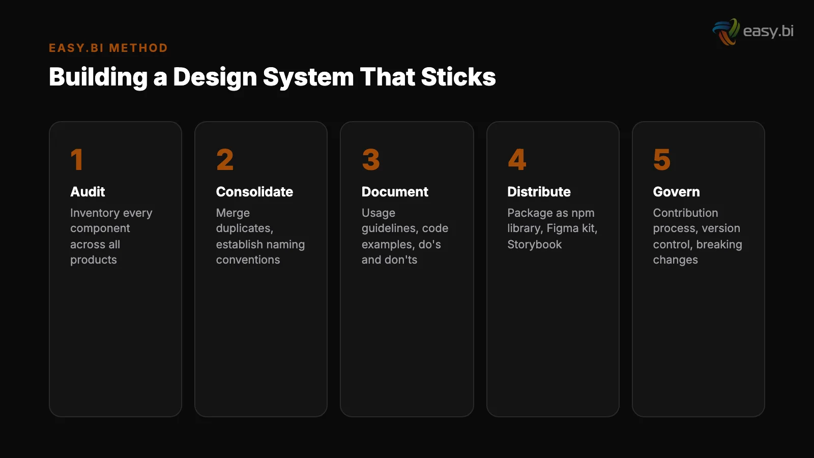
The governance model that works at enterprise scale has 4 elements:
1. A dedicated core team
1. A dedicated core team. Someone owns the design system as their primary responsibility. Not a side project. Not "the frontend team also maintains it." A dedicated team of 2-5 people (depending on organization size) whose job is maintaining the component library, reviewing contributions, managing versioning, and supporting adopting teams.
Without dedicated ownership, design systems decay within 12 months.
2. A contribution process. Application teams will encounter UI needs that the core library doesn't cover. A contribution process defines how those teams can propose new components, submit implementations, and have them reviewed for inclusion in the shared library.
The process must be lightweight enough that teams actually use it - if contributing a component requires a 10-page proposal, teams will build their own and skip the contribution.
2. A contribution process
3. Versioning and breaking change management. Enterprise applications cannot update their dependencies on a whim.
A clear versioning strategy (semantic versioning is the standard) with documented breaking changes, migration guides, and deprecation timelines gives teams confidence that adopting the design system won't break their applications unpredictably. 89% of IT leaders say technical debt impacts their ability to innovate [5].
Poorly managed design system versions create technical debt instead of reducing it.
4. Adoption metrics. Governance without measurement is wishful thinking. Track which teams are using the design system, which components are most and least adopted, and where teams are building custom components that overlap with existing library components.
These metrics tell you where the system is succeeding and where it needs improvement - whether that means better components, better documentation, or better outreach.
What Are the Biggest Adoption Challenges?
Design system initiatives fail more often from adoption problems than from technical problems. The library works. Teams just don't use it.
"Not invented here" syndrome. Senior developers who have been building custom components for years resist adopting a shared library. They know their codebase. They have opinions about how components should work. A shared library feels like a constraint, not a tool.
Overcoming this requires proving value on a specific, measurable project - not sending an email announcing that a design system exists.
"Not invented here" syndrome
Insufficient documentation. If developers have to read source code to understand how to use a component, adoption will be low. Every component needs clear documentation with code examples, all states demonstrated visually, accessibility notes, and common usage patterns.
Storybook solves this when used well, but the documentation must be maintained as actively as the code.
Design-development gap. If designers are working from a Figma library that doesn't match the Angular component library, every handoff creates friction. Tokens must stay synchronized. Component names must match. When a designer specifies a "card" component, the developer should find a component called "card" in the library with identical behavior.
Any divergence erodes trust in the system.
Insufficient documentation
Legacy application inertia. Migrating an existing application to use design system components requires effort, and application teams with full backlogs rarely prioritize it. The pragmatic approach: require the design system for all new features and new applications. Allow legacy applications to migrate incrementally, component by component, as they are maintained.
Forcing a full migration creates resistance; enabling gradual adoption builds momentum.
Performance concerns. Some teams resist shared component libraries because they worry about bundle size - importing an entire design system when they only use 10 components. Tree-shaking, modular package architecture, and lazy loading solve this technically.
But the concern must be addressed directly, with benchmarks, or it becomes a reason not to adopt.
50+ custom projects. 99.9% uptime. 60% faster.
Senior-only engineering teams deliver production-grade platforms in under 4 months. No juniors on your project.
Start with a Strategy CallHow Do You Measure Design System ROI?
The most common mistake in design system programs is failing to measure outcomes. Without measurement, the design system becomes a cost center that is easy to cut when budgets tighten.
Measure these 5 things:
1. Adoption rate
1. Adoption rate. Percentage of applications using the design system. Percentage of new features built with design system components versus custom components. Track both - total adoption and new-feature adoption. New-feature adoption should be at or near 100% within 12 months of launch.
2. Component coverage. Percentage of UI elements in production applications that come from the design system versus custom code. This is harder to measure but more meaningful than simple adoption rate. Tools like custom linting rules can automate this measurement.
2. Component coverage
3. Time-to-market impact. Compare feature delivery timelines before and after design system adoption. Cross-functional teams are 35% more productive than siloed teams working on the same type of project [6]. A design system amplifies this by giving cross-functional teams a shared language and shared building blocks.
4. Defect reduction. Track UI-related bugs before and after design system adoption. Fixing a UX problem in development costs 10x more than fixing it during design, and 100x more after release [7]. A design system catches UI issues at the component level, before they reach applications.
5. Developer satisfaction. Survey developers quarterly on their experience with the design system. Are components easy to find? Easy to use? Well-documented? Does the contribution process work? Developer satisfaction is a leading indicator - if developers find the system frustrating, adoption will decline regardless of management mandates.
Where Design Systems Fit in the Data-Driven UX Approach
A design system is infrastructure for a broader data-driven UX system. It enables the experimentation and iteration cycle by giving teams a stable foundation of components.
When you run an A/B test on a checkout flow, the components used in both variants should come from the design system - ensuring that the test measures the design change, not implementation inconsistencies.
Design systems also accelerate the UX audit process. When components are standardized, auditing for accessibility compliance, performance, and usability becomes a component-level exercise rather than an application-level one. Fix the component, fix every application that uses it.
The Siemens case demonstrates that the investment pays off at scale. The unified UI library did not just make applications look consistent - it freed engineering capacity from redundant UI work and redirected it toward the features and capabilities that differentiated each application.
That is the real business case: not consistency for its own sake, but engineering leverage that compounds across every team and every sprint.
If your enterprise is running multiple applications with fragmented UI approaches and you want to evaluate whether a design system is the right investment, explore our UX Growth services. We help organizations build, govern, and adopt design systems that deliver measurable returns - not just component libraries that collect dust.
References
- [1] Sparkbox Design Systems Survey - Design systems reduce design and development ti Source
- [2] Figma, "Design Systems at Scale" - Companies with mature design systems report 4 Source
- [3] Stripe Developer Coefficient Report - The average developer spends 41% of their
- [4] McKinsey, "The Business Value of Design" - Companies in the top quartile of McKi Source
- [5] McKinsey Technology Trends Outlook - 89% of IT leaders say technical debt impact Source
- [6] Harvard Business Review / Bain - Cross-functional teams are 35% more productive
- [7] Nielsen Norman Group, "Usability 101" - Fixing a UX problem in development costs Source
Explore Other Topics
Ready to build your custom platform?
30-minute call with an engineering lead. No sales pitch - just honest answers about your project.
98% engineer retention · 14-day delivery sprints · No lock-in contracts
Related Reading

How to Run Two Systems at Once: The Parallel-Run Playbook
61% of migration projects exceed planned timelines. This playbook covers the strangler fig pattern, feature flags, data synchronization, and rollback strategies for running legacy and new systems in parallel.
Filip Kralj
The Symfony Decision: When PHP Is the Right Enterprise Choice
PHP 8+ delivers 3x performance gains and Symfony provides enterprise-grade architecture out of the box. Learn when PHP beats Java and Node.js for enterprise applications, how API Platform accelerates development, and why 77% of server-side web runs on PHP.
Christian Kaspar
Why Your Vendor Built You a Cage (And How to Get Out)
Vendor lock-in costs DACH enterprises millions in switching costs, lost agility, and inflated licensing. Learn the 5 lock-in patterns, how to quantify the real cost, and practical strategies for escaping proprietary ecosystems using API-first architecture and open standards.
Andrej Lovsin