
Why Your Dashboard Confuses Users (And How to Fix It in a Sprint)
Table of Contents+
- Why Do Most Enterprise Dashboards Fail?
- What Does Information Overload Actually Look Like?
- How Do You Build a KPI Hierarchy That Works?
- Which Chart Type Should You Use for Which Data?
- Real-Time vs. Historical: When Does Each Matter?
- How Siemens Rebuilt Their Dashboard in One Sprint
- The One-Sprint Dashboard Fix Playbook
- References
TL;DR
I have reviewed over 50 enterprise dashboards in the past 3 years. The pattern is remarkably consistent: a development team builds a dashboard that shows every available metric, the stakeholders approve it because all the data is technically present, and then nobody uses it.
Key Takeaways
- •The average enterprise dashboard tries to show everything to everyone and ends up helping no one. Users spend 57% of their viewing time above the fold - if your most important KPI is buried below 3 charts nobody looks at, it might as well not exist.
- •Information overload is not a data problem - it is a design problem. Progressive disclosure, where you show summary metrics first and let users drill into detail on demand, improves task completion rates by 20-40%. The best dashboards hide complexity, not data.
- •Chart selection is not an aesthetic choice - it is a communication choice. Using a pie chart for 12 categories, a bar chart for time-series data, or a table for trend analysis are not style preferences. They are design errors that force users to decode rather than understand.
- •The one-sprint dashboard fix is real. In a single 2-week sprint, you can establish a KPI hierarchy, remove 40-60% of visual noise, implement progressive disclosure for secondary metrics, and validate with 5 users. Five user tests uncover approximately 85% of usability problems.
- •Real-time data on dashboards is rarely necessary and often counterproductive. Most business decisions depend on trends and patterns, not second-by-second updates. Real-time displays create anxiety without enabling action - unless the user can take immediate action based on what they see.
Most enterprise dashboards overwhelm users with data instead of enabling decisions. Learn how to fix information overload, build KPI hierarchies, choose the right charts, and apply progressive disclosure - with a sprint-scoped playbook and lessons from a Siemens dashboard redesign.
I have reviewed over 50 enterprise dashboards in the past 3 years. The pattern is remarkably consistent: a development team builds a dashboard that shows every available metric, the stakeholders approve it because all the data is technically present, and then nobody uses it.
Usage logs show 2-3 visits per week where they should show 2-3 visits per day. The dashboard exists, the data flows, and the business decisions it was built to support still happen in spreadsheets and email threads.
Why Do Most Enterprise Dashboards Fail?
Dashboard failure is not a technology problem. The queries work. The data is accurate. The charts render correctly. The failure is a design problem - specifically, a failure to distinguish between making data available and making data useful.
The root cause in nearly every case is the same: the dashboard was designed by working through a list of available data points and finding a way to display each one, rather than starting with the decisions the user needs to make and working backward to the minimum data required to make them.
Users spend 57% of their page-viewing time above the fold, with engagement dropping sharply below [1]. On a dashboard, this means the 3-5 metrics visible without scrolling receive 10x more attention than everything below.
If those top metrics are not the most decision-critical KPIs, the dashboard's most valuable real estate is wasted.
Users read only 20-28% of words on an average page [2]. On a data-dense dashboard, that percentage drops further. Every additional chart, label, and annotation competes for the tiny share of attention your user has available.
The dashboard with 30 charts does not communicate 3x more than the one with 10 - it communicates less, because attention is scattered instead of focused.
Every $1 invested in UX returns $100 [3]. For dashboards specifically, the return is even higher because a well-designed dashboard affects decisions made multiple times per day by multiple stakeholders.
A dashboard that helps a logistics manager identify and resolve a bottleneck 30 minutes faster, used 200 times per year across 10 managers, creates thousands of hours of operational value.
See how we deliver AI-powered efficiency gains.
What Does Information Overload Actually Look Like?
Information overload on dashboards manifests in specific, diagnosable patterns. Recognizing them is the first step to fixing them.
The "everything dashboard." 30+ metrics on a single view. No visual hierarchy. Every chart is the same size. The user's eye has no entry point and no scan path. This is the most common failure mode - built by teams who equated completeness with usefulness.
The "rainbow dashboard." 8+ colors with no semantic meaning. Green does not mean good. Red does not mean bad. Blue, orange, purple, and teal appear because the charting library cycles through its default palette. Color becomes noise instead of signal.
The "real-time anxiety machine." Numbers updating every 5 seconds. Line charts with jittery real-time feeds. Counters ticking up. The user watches the numbers move but cannot determine whether the movement is significant or normal variance. Real-time data creates urgency without context.
The "table masquerading as a dashboard." 15 columns of raw data in a grid with sort and filter controls. Technically functional. Practically useless for the pattern recognition that dashboards are supposed to enable.
If users need to do mental arithmetic to derive the insight, the dashboard has failed at its primary job.
How Do You Build a KPI Hierarchy That Works?
A KPI hierarchy is the structural backbone of any effective dashboard. It answers a simple question: if the user has 10 seconds, what should they see? If they have 30 seconds? If they have 2 minutes?
Level 1: Health indicators (10-second glance). 3-5 top-level metrics that answer "is everything okay?" These are the metrics that appear above the fold, in the largest visual treatment. For an e-commerce dashboard: revenue today vs. target, conversion rate, and active sessions.
For a logistics dashboard: orders in transit, on-time delivery rate, and exceptions requiring action.
Level 1: Health indicators (10-second glance)
Level 2: Diagnostic metrics (30-second scan). 8-12 metrics that answer "why is it okay or not okay?" These break down the Level 1 metrics into their components. Revenue breaks into traffic x conversion x average order value. On-time delivery breaks into carrier performance, fulfillment speed, and inventory availability.
Level 2 metrics are visible on the default view but in smaller visual treatments.
Level 3: Detail data (2-minute investigation). The granular data that supports root-cause analysis. Individual order records, hourly traffic breakdowns, SKU-level performance. This level is accessed through drill-down interactions, not displayed on the default view.
| KPI Level | Count | User Time | Display Treatment | Interaction |
|---|---|---|---|---|
| Level 1: Health | 3-5 metrics | 10 seconds | Large cards, above the fold | Visible by default |
| Level 2: Diagnostic | 8-12 metrics | 30 seconds | Medium charts, below Level 1 | Visible by default, smaller |
| Level 3: Detail | Unlimited | 2+ minutes | Tables, detailed charts | Accessed via drill-down |
Progressive disclosure - showing summary first and letting users drill into detail on demand - improves completion rates by 20-40% [4].
Applied to dashboards, this means every Level 1 metric is a clickable entry point into its Level 2 breakdown, and every Level 2 metric links to its Level 3 detail. The user never sees more complexity than their current task requires.
Which Chart Type Should You Use for Which Data?
Chart selection is the second most common dashboard failure, after information overload. The wrong chart type forces users to decode data rather than understand it, adding cognitive load to every interaction.
Rules that work consistently across enterprise dashboards:
Time-series data: line chart
Time-series data: line chart. Always. Not bar charts (which work for categorical comparisons, not temporal trends). Not area charts (which obscure actual values when multiple series overlap). Line charts show trends, inflection points, and seasonality at a glance.
Categorical comparison: horizontal bar chart. When comparing revenue across 8 product categories, conversion rates across 5 channels, or performance across 12 team members, horizontal bars allow labels to be read naturally (left to right) without the rotated text that vertical bars require.
Categorical comparison: horizontal bar chart
Part-of-whole: stacked bar or treemap. Not pie charts. Pie charts are readable with 2-3 segments and misleading with more. The human eye is poor at comparing angles and areas but good at comparing lengths. A stacked bar communicating the same data is faster to read and more accurate to interpret.
Single metric with context: number card with sparkline. Revenue today: EUR 47,200 with a 7-day sparkline showing the trend. The number answers "what." The sparkline answers "compared to what." Together they provide enough context for a Level 1 health check without requiring a full chart.
Correlation between two variables: scatter plot. When you need to understand whether marketing spend correlates with lead volume, or whether page load time correlates with bounce rate, scatter plots reveal patterns that no other chart type surfaces.
But use them only when the audience understands scatter plots - for executive dashboards, a simple comparison table may communicate the same insight more reliably.
Real-Time vs. Historical: When Does Each Matter?
The default assumption in enterprise dashboards is that real-time is better. More current data means better decisions. This assumption is wrong more often than it is right.
Real-time data is valuable only when the user can take immediate action based on what they see. A network operations center monitoring server health in real time makes sense - an operator can restart a service the moment latency spikes.
A marketing manager watching campaign performance update every 5 seconds does not make sense - no marketing decision should be made based on 5 seconds of data.
For most business dashboards, the right refresh cadence is:
- Every 15-30 minutes: Operational dashboards where users monitor ongoing processes (order fulfillment, customer support queues, inventory levels)
- Every hour: Performance dashboards tracking campaign metrics, traffic, and conversion rates
- Daily: Strategic dashboards showing revenue, pipeline, and resource utilization
- Weekly or monthly: Executive dashboards showing trends, targets vs. actuals, and portfolio health
The exception is alerting. When a metric crosses a critical threshold (conversion rate drops 50% in an hour, error rate exceeds 5%), real-time notification is essential.
But the notification should be a push alert - an email, a Slack message, a mobile push - not a dashboard that someone needs to be watching at the exact right moment.
The best dashboards are not the ones with the freshest data. They are the ones that match data freshness to decision frequency. If you make pricing decisions monthly, a real-time pricing dashboard creates noise without enabling action.
3x faster development with our ebiCore AI framework
Identify your top AI opportunities, validate with a PoC, and ship to production.
Start with a Strategy CallHow Siemens Rebuilt Their Dashboard in One Sprint
When easy.bi worked with Siemens on their unified UI library, one of the deliverables was a standardized dashboard framework used across multiple internal applications.
The challenge was representative of what most enterprises face: dozens of teams building dashboards independently, with no shared design patterns, no consistent KPI hierarchies, and widely varying levels of usability.
The initial audit revealed familiar problems. One team's dashboard displayed 47 metrics on a single view. Another used 11 different chart types across 15 charts. A third had a dashboard that loaded in 8 seconds because it queried 9 data sources simultaneously on page load.
Day 1-2: User research
The one-sprint fix focused on the highest-traffic dashboard - the one used by 200+ internal users daily. The approach:
Day 1-2: User research. 5 interviews with the dashboard's primary users. What decisions do you make using this dashboard? Which metrics do you check first? Which charts do you never look at?
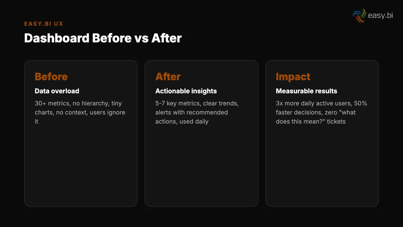
The interviews confirmed that users cared about 6 metrics out of 47 displayed, and the 6 metrics were not the ones given the most visual prominence.
Day 3-5: Redesign. Restructured the dashboard using the 3-level KPI hierarchy. The 6 decision-critical metrics became Level 1. 12 supporting metrics became Level 2, accessible through drill-down. The remaining 29 metrics were moved to an "Advanced" tab that maintained backward compatibility without cluttering the primary view.
Design systems reduce design and development time by 25-50% [5] - the Siemens design system meant UI components were pre-built, so the sprint focused on information architecture rather than visual design.
Day 3-5: Redesign
Day 6-8: Implementation. Built using the shared Angular component library from the Siemens UI system. Progressive disclosure implemented through expandable panels. Page load reduced from 8 seconds to 1.2 seconds by lazy-loading Level 2 and Level 3 data only when requested.
Day 9-10: Validation. 5 user tests with the same users from Day 1-2. Five user tests uncover approximately 85% of usability problems [6]. Task completion time for the primary use case dropped from 2.5 minutes to 40 seconds.
All 5 users identified the correct KPIs within 10 seconds on the new design, compared to an average of 35 seconds on the old one.
The framework patterns established in this sprint were then rolled out to 12 other dashboards over the following quarter, each adaptation taking 3-5 days rather than a full sprint because the patterns and components were reusable.
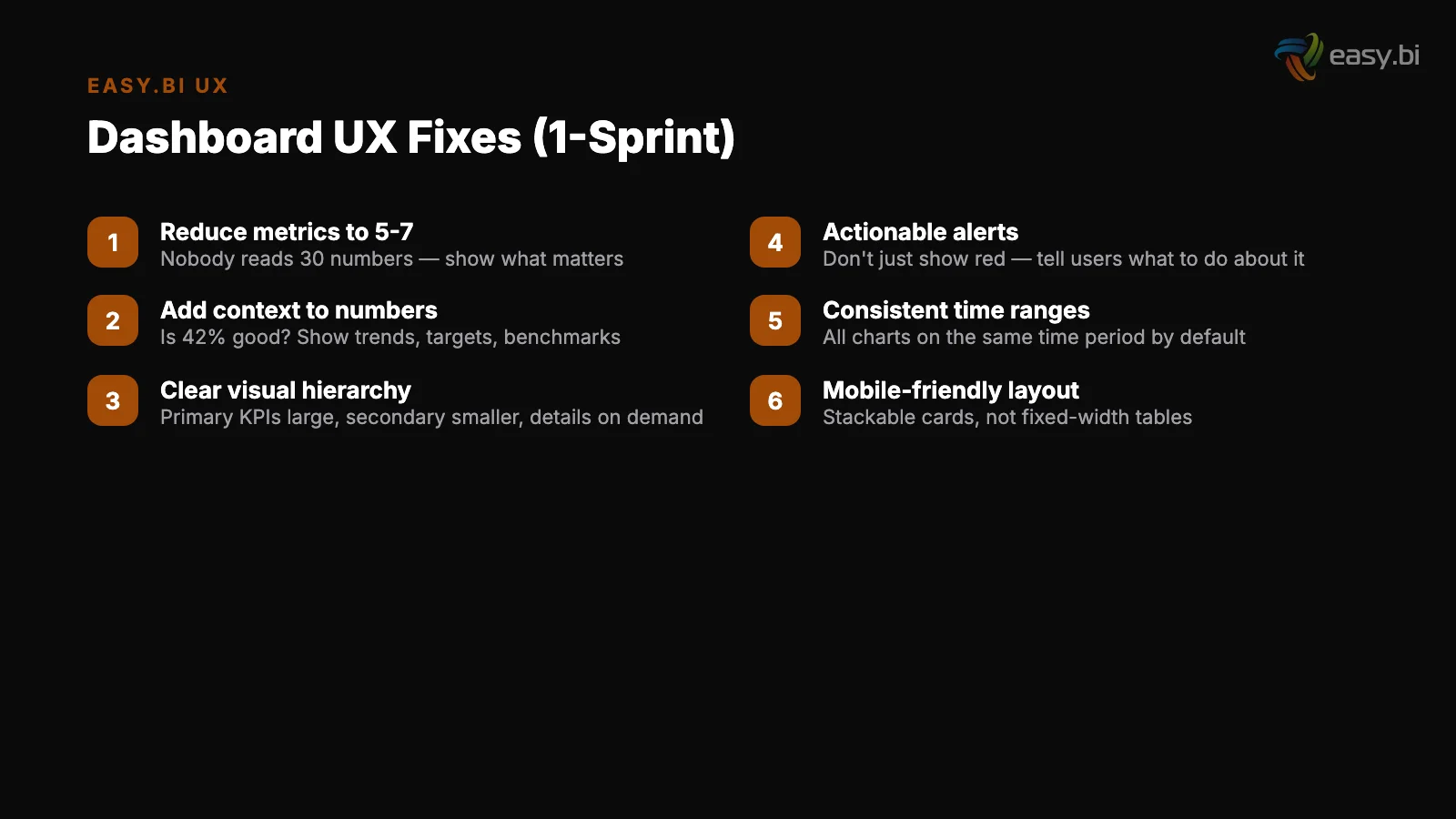
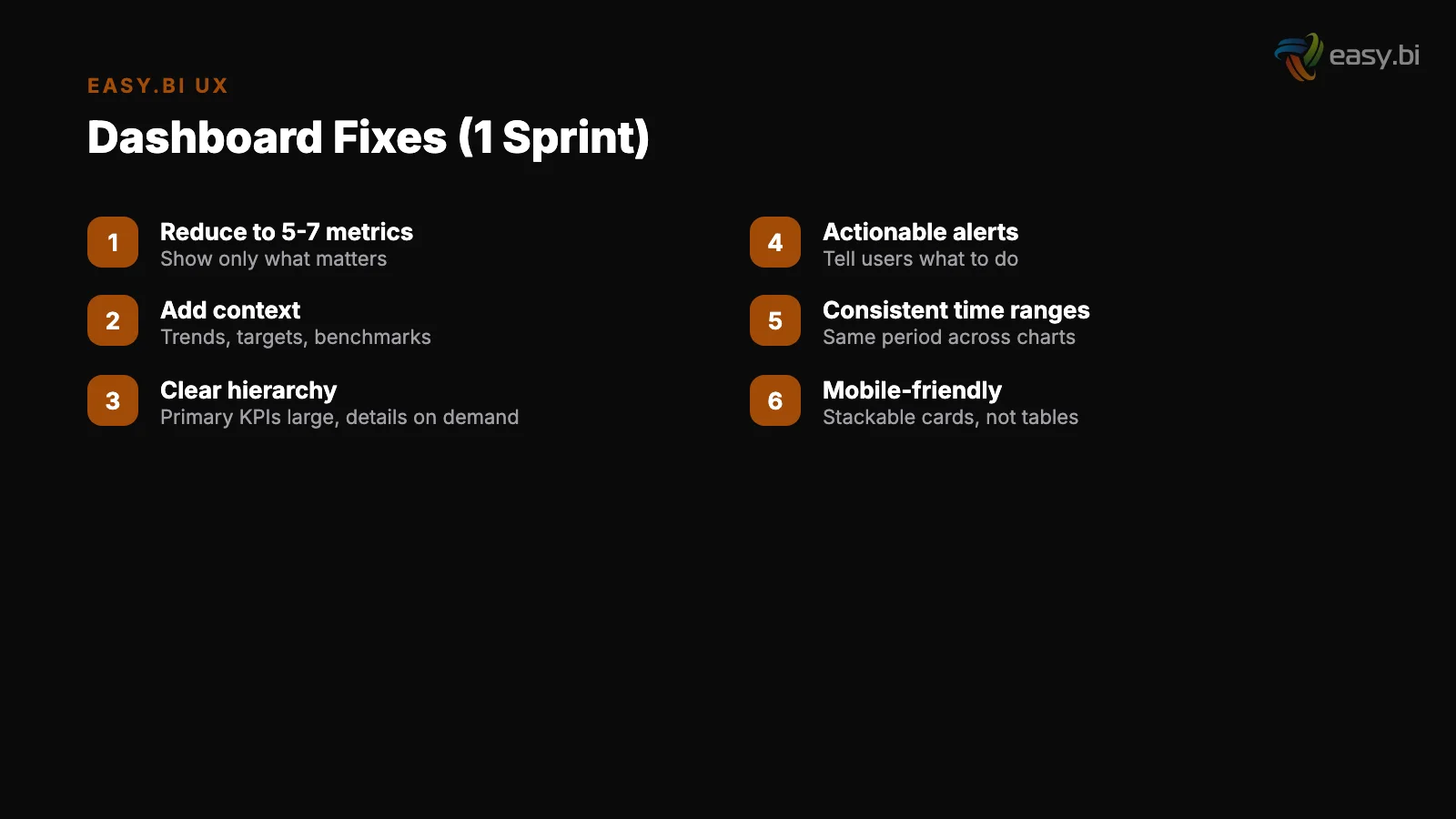
The One-Sprint Dashboard Fix Playbook
You do not need a quarter-long redesign project to fix a broken dashboard. The Siemens pattern works for any enterprise dashboard, and it fits in a single 2-week sprint.
Sprint day 1: Identify the top 5 decisions. Interview 3-5 primary users. Ask what decisions they make using the dashboard and what data they need for each decision. Do not ask what they want - ask what they do.
Sprint day 2: Build the KPI hierarchy. Map user decisions to the metrics that support them. Assign each metric to Level 1 (always visible), Level 2 (visible on scroll or click), or Level 3 (accessible through drill-down). If more than 5 metrics end up at Level 1, force-rank them.
Sprint day 1: Identify the top 5 decisions
Sprint day 3-4: Simplify the visual design. Remove all charts that do not map to a user decision. Replace incorrect chart types. Reduce the color palette to 3 semantic colors (positive, negative, neutral) plus 1-2 data series colors. Increase whitespace between chart groups.
Sprint day 5-7: Implement progressive disclosure. Build expandable sections for Level 2 data. Add drill-down links from Level 1 cards to their Level 2 breakdowns. Lazy-load Level 2 and Level 3 data to reduce initial page load.
Sprint day 8-9: Test with 5 users. Give each user 3 tasks that map to the primary use cases. Measure task completion time and accuracy. Note where users hesitate or click incorrectly. Fix the top 3 issues identified.
Sprint day 2: Build the KPI hierarchy
Sprint day 10: Ship and measure. Deploy the redesigned dashboard. Set up usage analytics: daily active users, time on dashboard, drill-down rates, and feature adoption. Compare these metrics against the pre-redesign baseline after 2 weeks.
This playbook consistently delivers a 40-60% reduction in task completion time and a 2-3x increase in daily active usage. Not because it adds features - because it removes friction.
For the complete framework on building data-driven UX systems that scale across enterprise applications, read our pillar guide on the data-driven UX system. For how design systems like the one built for Siemens enable rapid dashboard improvements, see design systems at enterprise scale.
And for a structured approach to identifying UX issues before they reach users, read our UX audit checklist.
If your team has dashboards that users avoid, that is a fixable problem - often in a single sprint. Explore our UX growth approach to see how we help enterprise teams turn data-heavy interfaces into decision-enabling tools.
References
- [1] Nielsen Norman Group (2023). nngroup.com
- [2] Nielsen Norman Group (2023). nngroup.com
- [3] Forrester Research (2022). "Every $1 invested in UX returns $100 (ROI of 9,900%). forrester.com
- [4] Nielsen Norman Group (2023). nngroup.com
- [5] Sparkbox (2023). "Design systems reduce design and development time by 25-50%. sparkbox.com
- [6] Nielsen Norman Group (2023). nngroup.com
Explore Other Topics
Ready to unlock AI-driven efficiency?
30-minute call with an engineering lead. No sales pitch - just honest answers about your project.
98% engineer retention · 14-day delivery sprints · No lock-in contracts
Related Reading

Why Your E-Commerce Analytics Are Lying to You (And How to Fix It)
Most DACH e-commerce teams make decisions on incomplete data. Learn why GA4 alone is not enough, how consent rates distort your numbers, and how to build a 4-tool analytics stack that shows what is actually happening in your store.
Timo Koerner
Mobile UX for B2B: Your Enterprise Users Are on Phones Now
Mobile conversion rates are 63% lower than desktop. B2B decision-makers now research, compare, and approve purchases on their phones. Learn how to close the mobile gap with responsive design, touch optimization, form reduction, and offline-first patterns.
Timo Koerner
The UX Audit Checklist: 30 Things to Fix Before You Redesign
Before spending EUR 100K+ on a redesign, fix these 30 UX issues first. A structured audit checklist covering navigation, forms, performance, mobile, accessibility, and visual hierarchy.
Timo Koerner