How Etherforce Made Festival Crew Management Work on Any Device
Etherforce's CrewAdmin tool managed thousands of temporary event staff - but only from a desktop. easy.bi redesigned the entire UX for mobile-first usability, transforming how festivals manage their workforce.
The Challenge: Managing Festival Crews From a Desktop-Only Tool
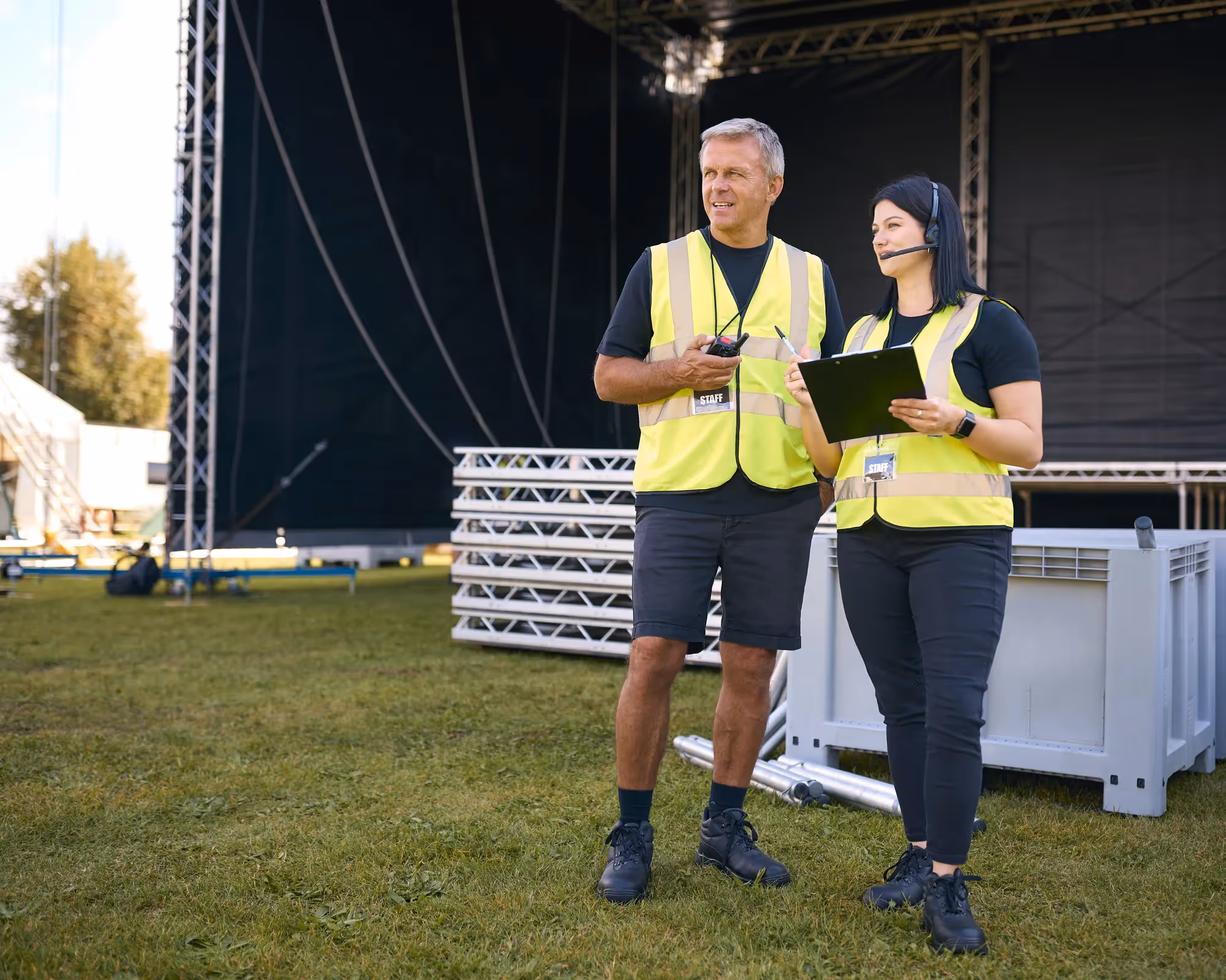
Etherforce provides IT infrastructure for Germany's largest music festivals - events with tens of thousands of attendees that require reliable hardware, internet, and technical support. Behind every festival's smooth operation is a small army of temporary staff: technicians, coordinators, and support crew assembled weeks before the event.
To manage this workforce, Etherforce built CrewAdmin - a tool that handles the complete lifecycle of temporary staff, from application and shift planning to time tracking and payroll processing. It's the backbone of their event operations.
The problem: CrewAdmin was designed for desktop use. Event managers sitting at a desk could navigate its features. But the people who needed it most - coordinators on festival grounds, supervisors moving between stages, crew leads checking shift assignments - couldn't use it effectively on their phones. Buttons were too small. Forms required horizontal scrolling. Navigation buried critical features behind multiple clicks.
For a tool that manages thousands of workers across a multi-day festival, mobile usability wasn't a nice-to-have. It was the difference between a coordinator checking shift assignments on their phone in real time and walking back to a trailer to use a laptop.
“Our coordinators were walking back to the production trailer just to check shift assignments. A crew management tool that doesn't work on a phone is broken at a festival.”
Why Etherforce Chose easy.bi
Etherforce needed a UX partner who understood the difference between making a desktop application responsive and designing a genuinely mobile-first experience. They had tried adding responsive breakpoints before - the result was a shrunken desktop layout that technically fit on a phone but was painful to use.
easy.bi's UX team approached the project differently. Rather than adapting the existing desktop layout, they proposed rethinking the user flows from the mobile context outward: what does a coordinator need to do on a phone at a festival? That question drove every design decision. Etherforce chose easy.bi because the team prioritized user behavior over pixel-level design specifications.
“easy.bi didn't just shrink our desktop layout onto a phone. They asked what a coordinator actually needs to do while standing between two stages at midnight. That's the right question.”
The Approach: Mobile-First Redesign for Real-World Event Conditions
The easy.bi UX team started by mapping how CrewAdmin was actually used during festivals - not how it was designed to be used. They identified three user profiles with distinct needs: event managers (planning, desktop), coordinators (on-ground, mobile), and crew leads (shift checks, mobile).
Optimizing the user interface for touch and speed. Every interactive element was redesigned for touch targets. Buttons grew to 44px minimum. Form inputs were stacked vertically. Navigation moved from a multi-level sidebar to a tab-based structure that kept the most-used features within one tap. Status indicators used color coding that worked in direct sunlight - a practical consideration for outdoor festivals.
Improving user flows for common tasks. The most frequent mobile action - checking who's on shift right now - went from 4 clicks to 1. Shift swaps, which previously required navigating to a worker's profile, finding their schedule, and manually reassigning, became a drag-and-drop operation on a simplified timeline view. Time tracking check-ins were reduced to a single confirmation screen.
Mobile-first responsive architecture. Rather than hiding desktop features on smaller screens, the redesign created distinct mobile layouts that surfaced the right information for mobile contexts. A coordinator's phone view showed active shifts, check-in status, and crew locations. The same coordinator's desktop view added planning tools, payroll summaries, and reporting dashboards.
The redesigned interface was tested with Etherforce's actual coordinators during pre-event setup, and feedback from those sessions directly influenced the final design decisions.
“The UX team tested designs with our actual coordinators during pre-event setup. The feedback loop was tight - we saw changes reflected within days, not weeks.”
The Results: Crew Management That Works at Festival Speed
The redesigned CrewAdmin transformed how Etherforce manages event operations. Coordinators stopped carrying laptops to festival grounds. Shift checks, time tracking, and crew communication all happened on phones - in the same environment where the work was actually happening.
Task completion times dropped across every major workflow. The shift-check flow went from 4 taps to 1. Shift swaps that previously required desktop access now took under 30 seconds on a phone. Time tracking check-ins became a one-screen confirmation instead of a multi-step form.
For Etherforce, the business impact was direct: faster crew coordination, fewer scheduling errors during live events, and a workforce management tool that finally matched the pace of festival operations.
“Shift swaps used to require a laptop and 3 minutes of clicking. Now it's a 30-second interaction on a phone. During a live festival, that time difference matters.”
Key Takeaways
- Mobile-first means rethinking workflows, not shrinking screens. The desktop layout couldn't simply be made responsive. Each mobile flow was redesigned from the user's real-world context - standing at a festival, often in poor lighting, needing information in seconds.
- Test with actual users in actual conditions. Testing with coordinators during pre-event setup revealed usability issues that lab testing would have missed - like status indicators that were invisible in direct sunlight.
- Reduce taps for the most frequent action. Identifying that shift-checking was the #1 mobile action and reducing it from 4 taps to 1 delivered the largest usability improvement with the smallest design change.
- Design for distinct user profiles. Event managers, coordinators, and crew leads use the same tool differently. Separate mobile layouts for each profile meant every user saw what they needed - nothing more.
Ready to achieve similar results?
Speak directly with our experts. Book a 20-minute Expert Call.
Start with a Strategy CallProject Snapshot
More success stories

Multi-brand e-commerce platform with SSO for outdoor brands
Order processing middleware for multi-store Shopify operations
